QUEST AI - BRANDING
QUEST AI - BRANDING
QUEST AI - BRANDING
2020 - 2023
2020 - 2023
2020 - 2023
Brand design for Quest AI
Brand design for Quest AI
Brand design for Quest AI
See More
See More
See More
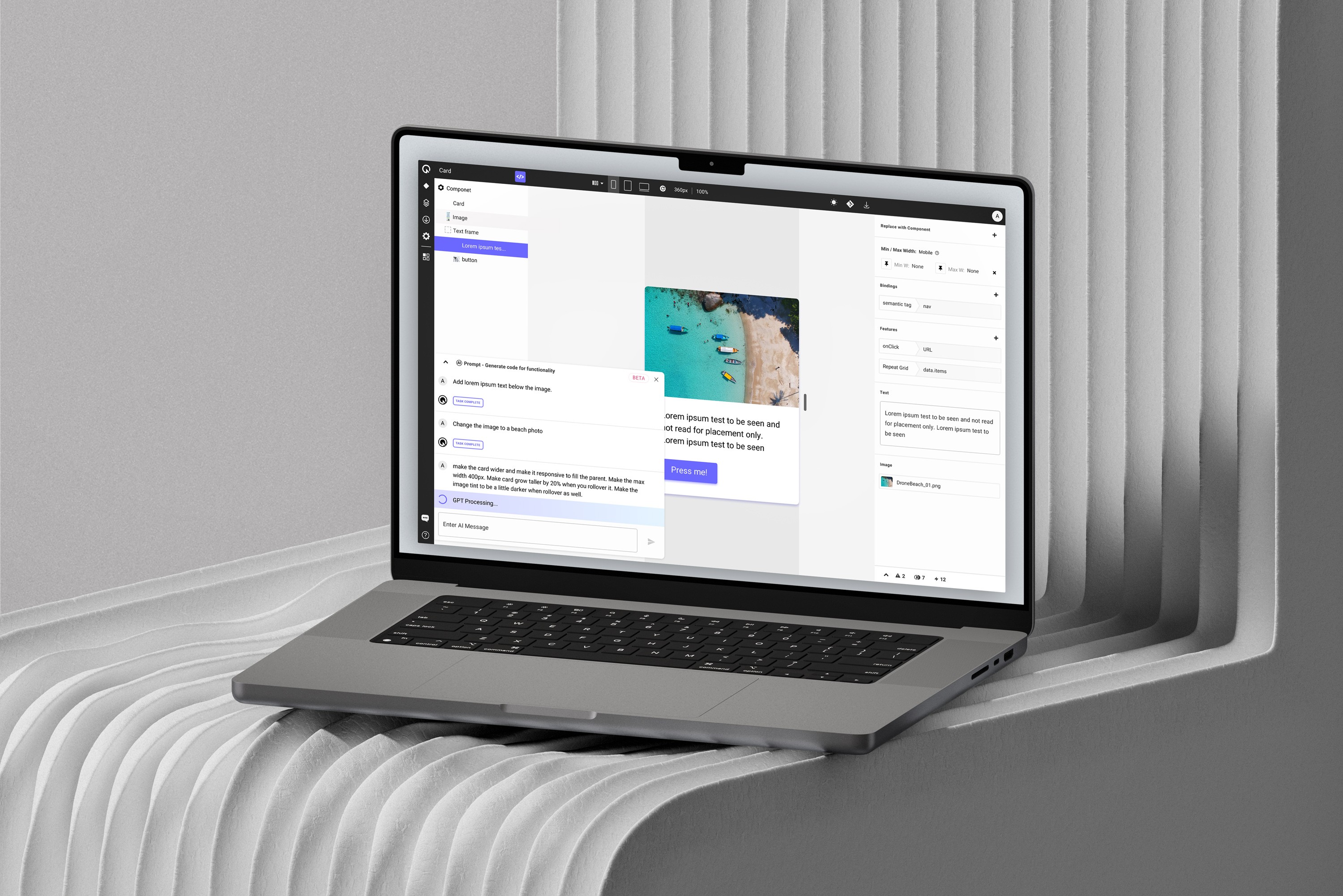
As Head of Product working with Quest AI, I designed logos, marketing materials, presentations, and more. I also played a key role in developing the brand strategy. Because it was a seed stage startup, I wore a lot of hats and helped create the visual identity and content for all aspects of the company.
As Head of Product working with Quest AI, I designed logos, marketing materials, presentations, and more. I also played a key role in developing the brand strategy. Because it was a seed stage startup, I wore a lot of hats and helped create the visual identity and content for all aspects of the company.
As Head of Product working with Quest AI, I designed logos, marketing materials, presentations, and more. I also played a key role in developing the brand strategy. Because it was a seed stage startup, I wore a lot of hats and helped create the visual identity and content for all aspects of the company.
Company
Company
Quest AI
Quest AI
Year
Year
2020 - 2023
2020 - 2023
Skills
Skills
Branding
Creative Direction
Visual Design
LOGO
LOGO
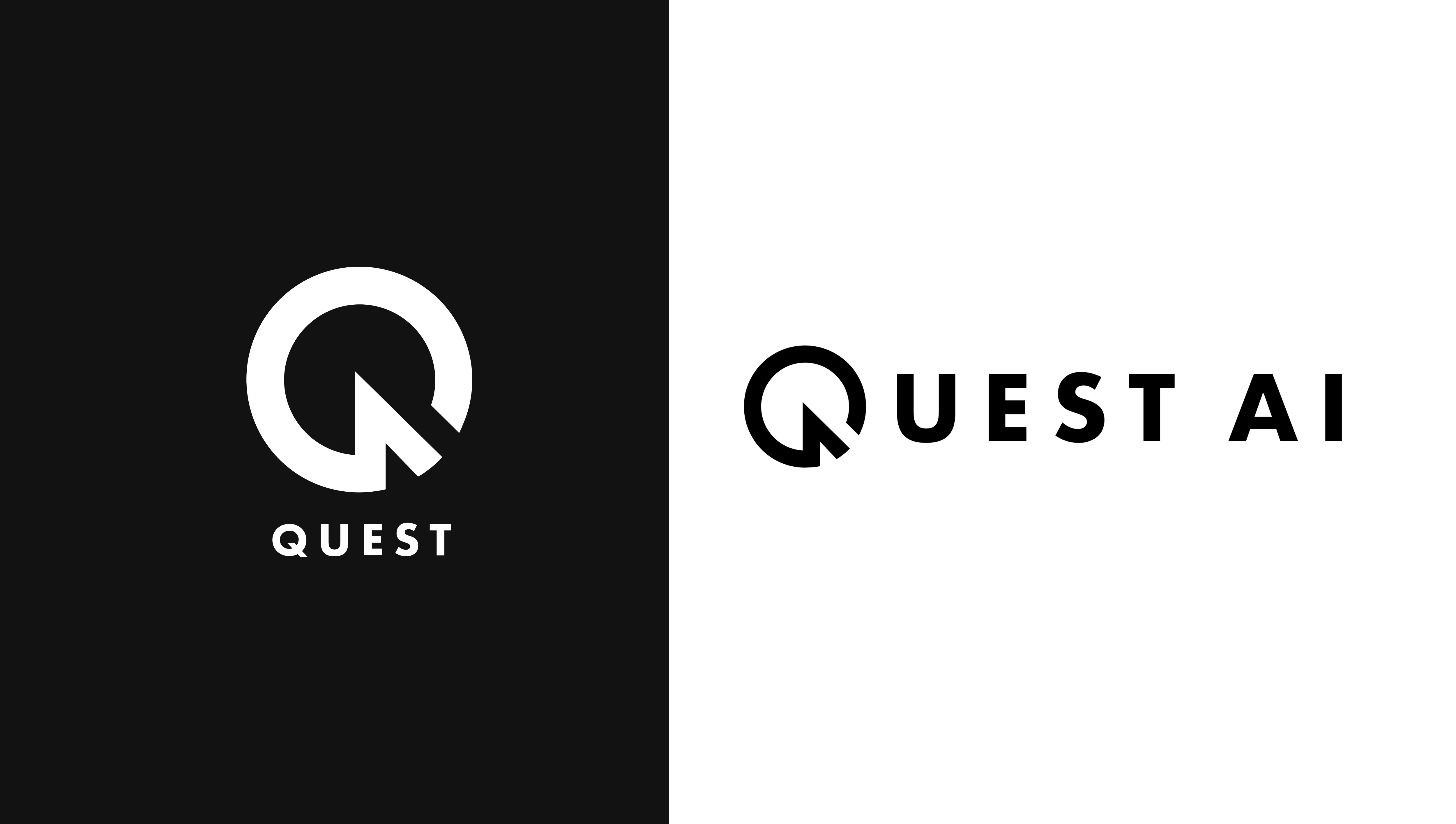
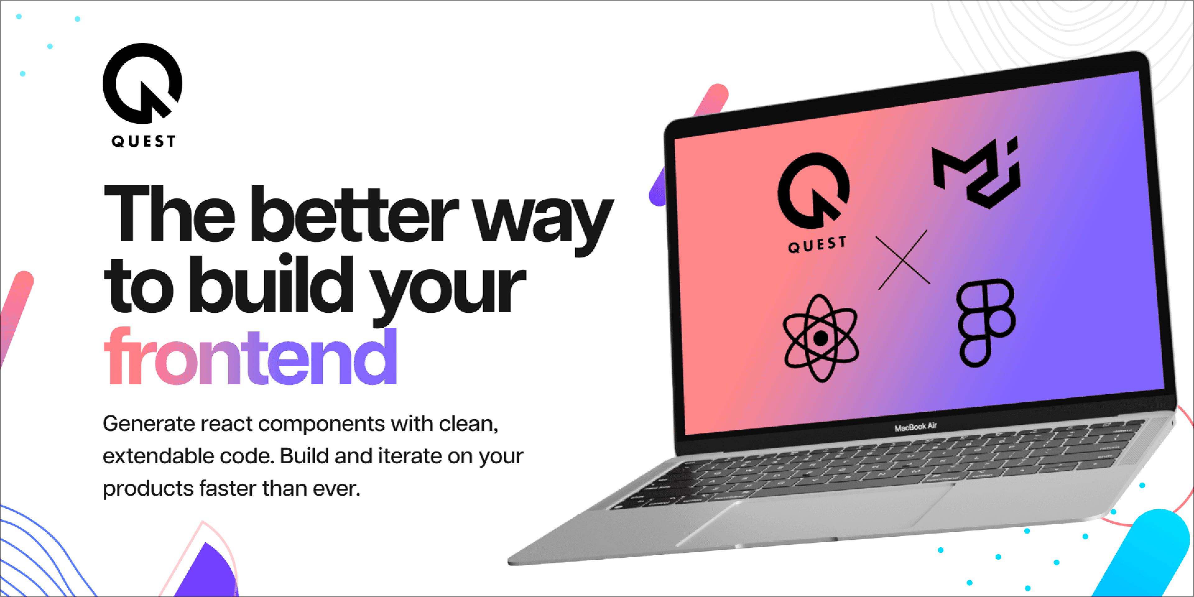
While the name "Quest" came from the early idea that we would be building a design-to-code gaming platform, we always had larger aspirations and thus wanted the logo to feel more timeless. I've always believed a good logo is one you can immediately remember and wanted to be clean and minimal so that we could expand to any industry.
While the name "Quest" came from the early idea that we would be building a design-to-code gaming platform, we always had larger aspirations and thus wanted the logo to feel more timeless. I've always believed a good logo is one you can immediately remember and wanted to be clean and minimal so that we could expand to any industry.
While the name "Quest" came from the early idea that we would be building a design-to-code gaming platform, we always had larger aspirations and thus wanted the logo to feel more timeless. I've always believed a good logo is one you can immediately remember and wanted to be clean and minimal so that we could expand to any industry.
MARKETING VISUALS
MARKETING VISUALS
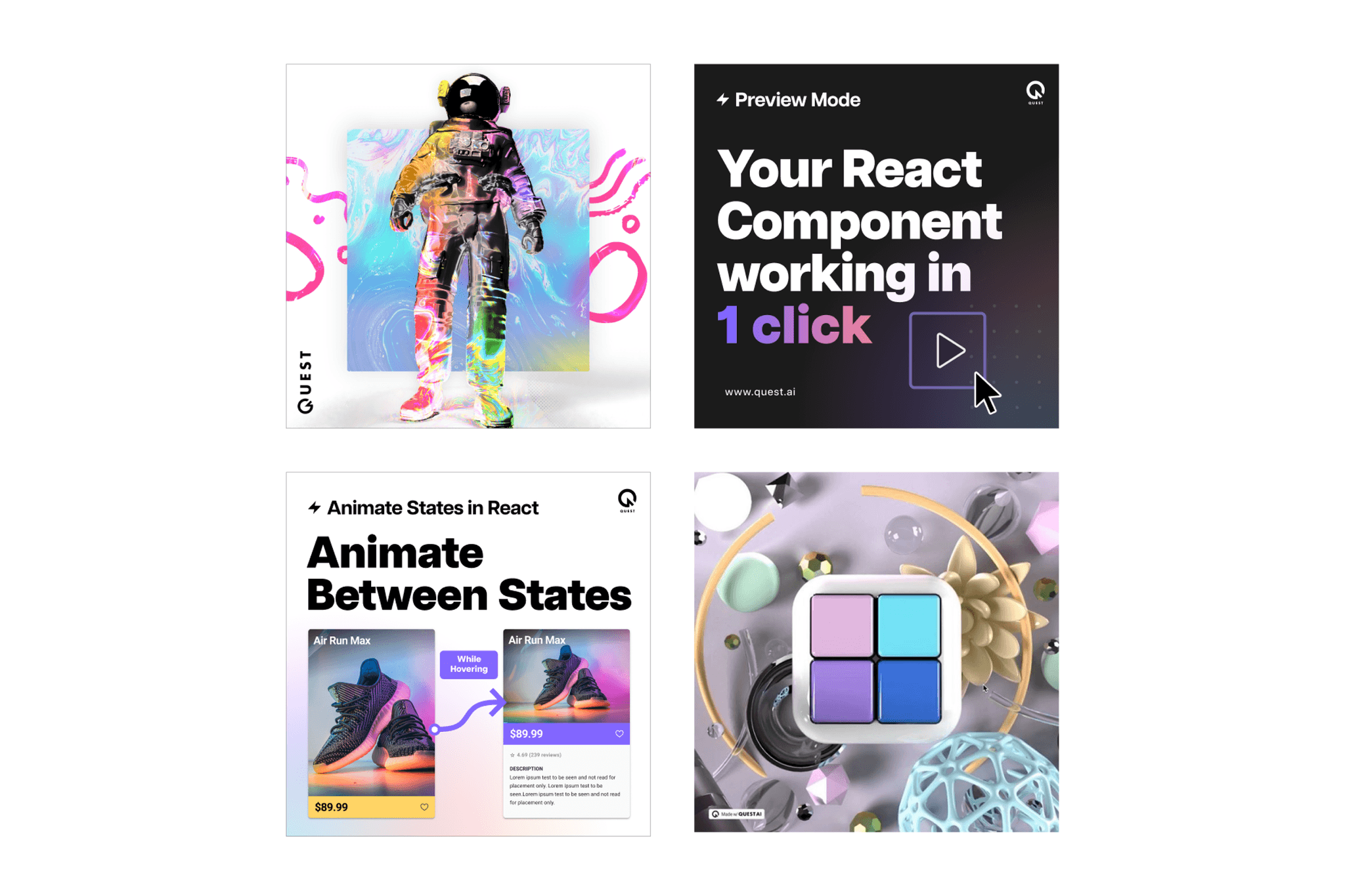
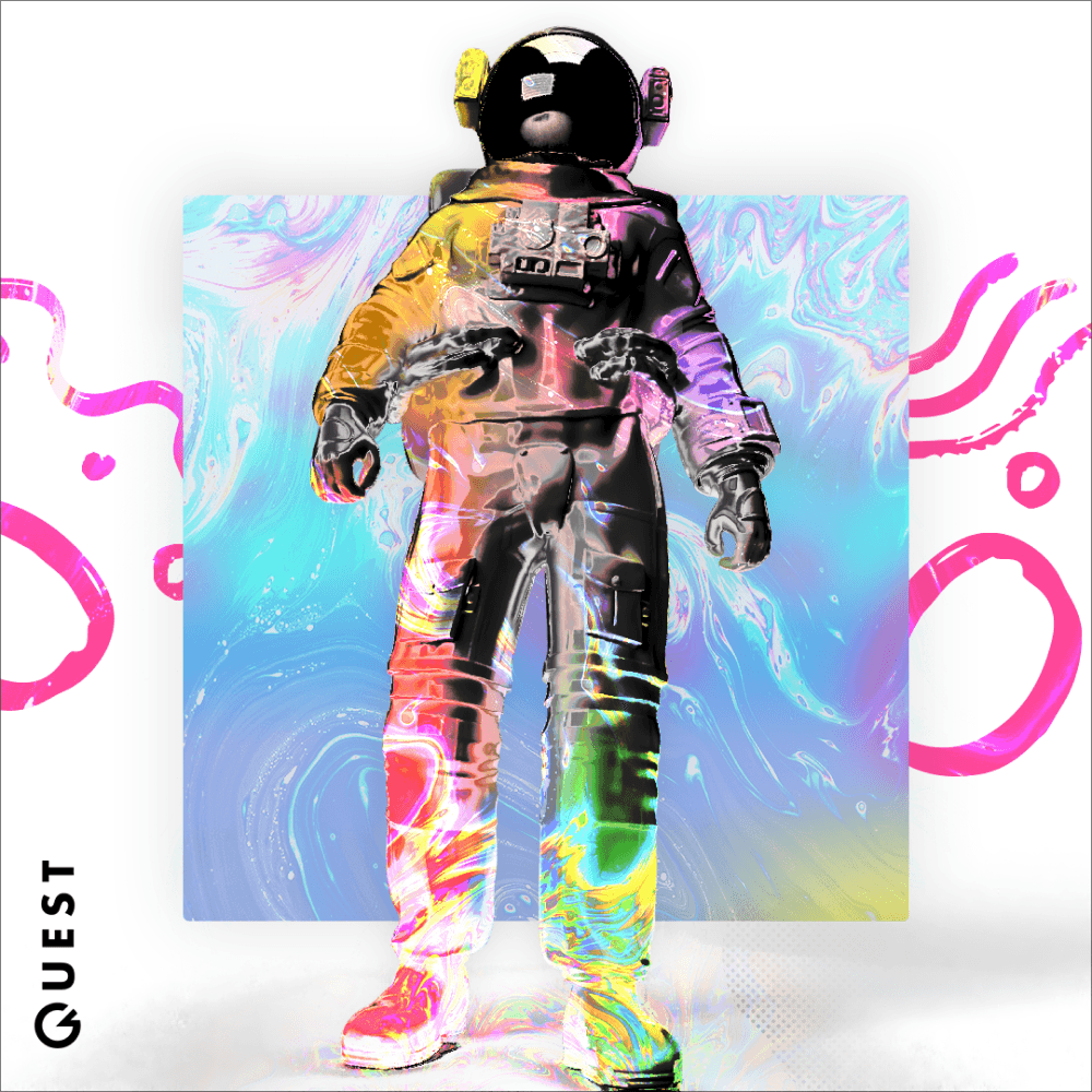
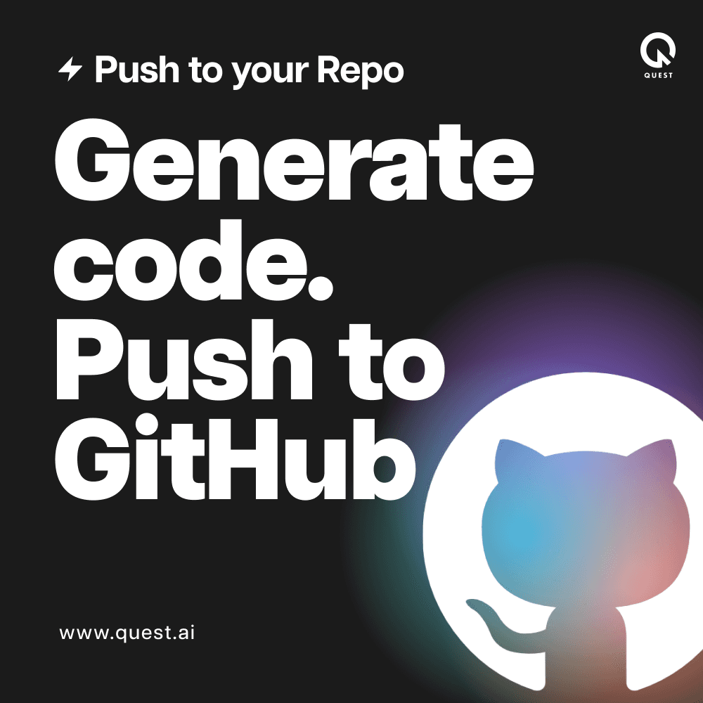
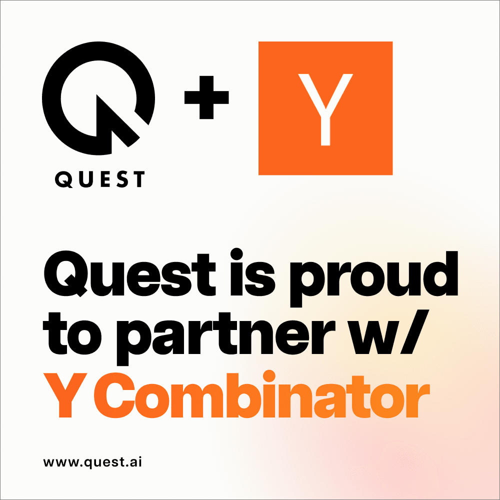
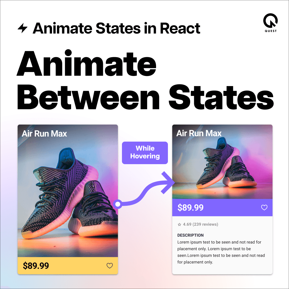
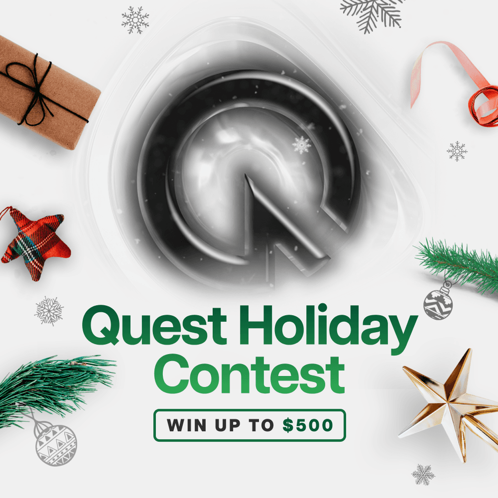
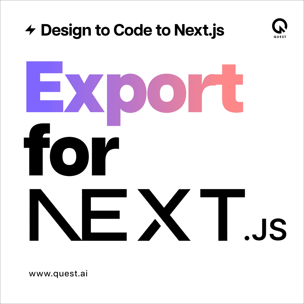
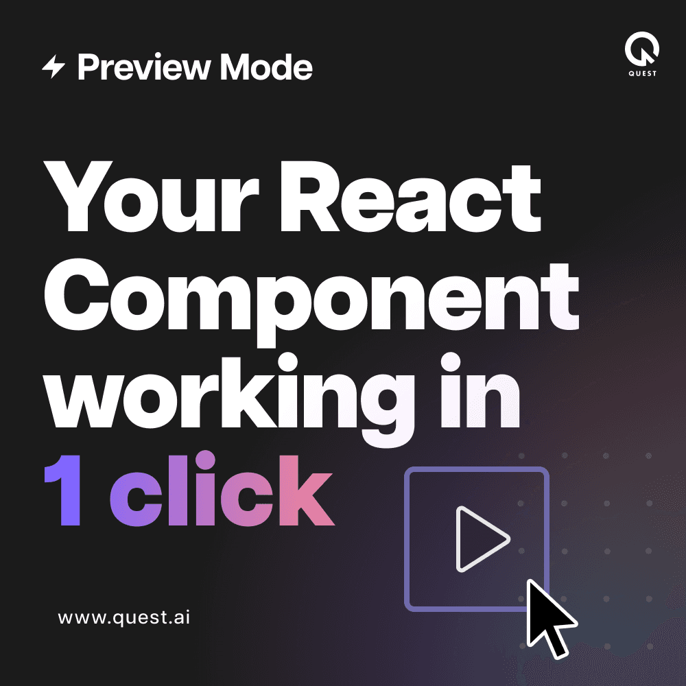
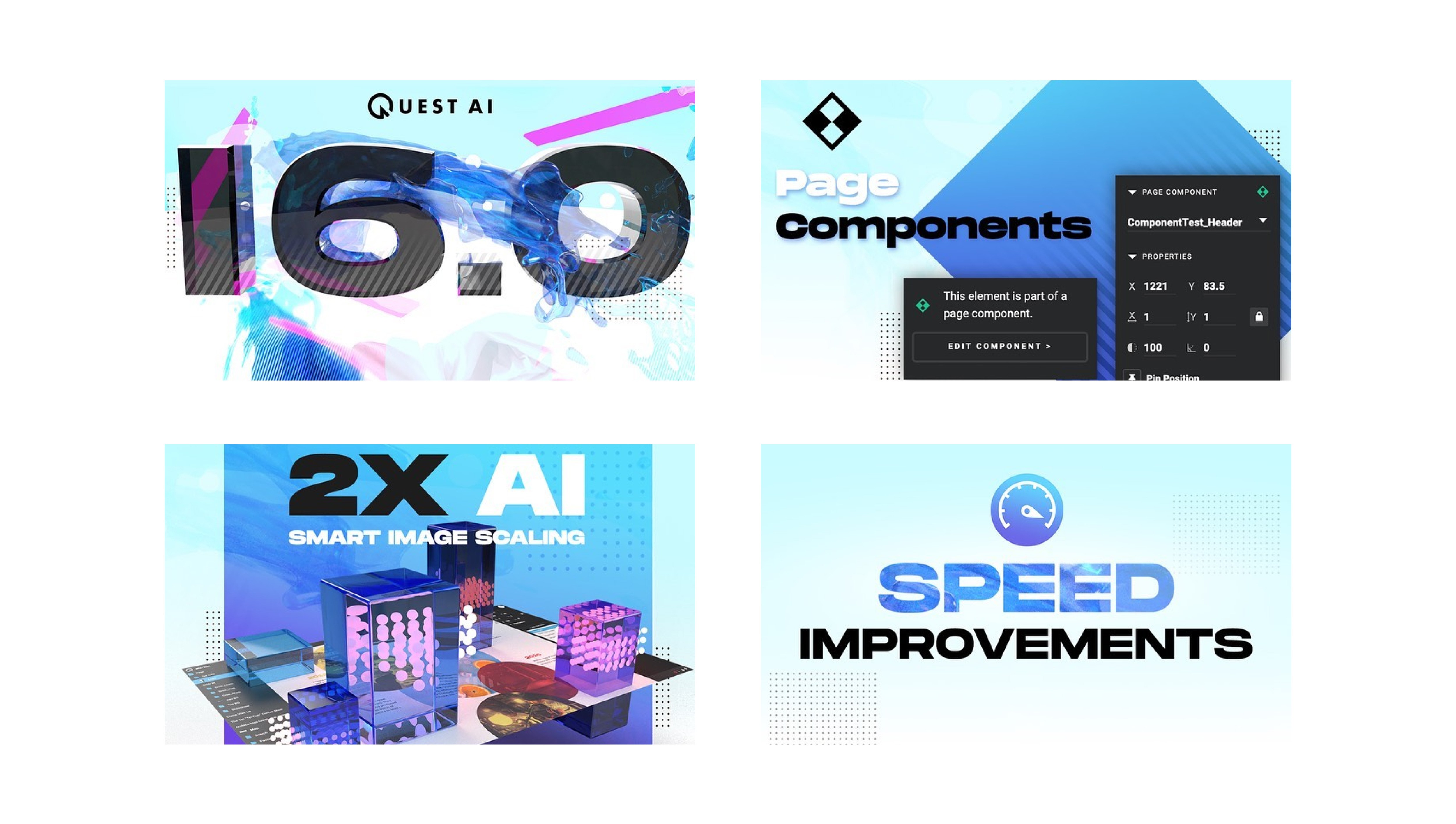
To increase awareness about Quest, I would create a social post that would go out to various social channels. These posts mostly revolved around new features of the product but sometimes in between longer sprints I would post simple social posts focused more on branding. Here are several over the years.
To increase awareness about Quest, I would create a social post that would go out to various social channels. These posts mostly revolved around new features of the product but sometimes in between longer sprints I would post simple social posts focused more on branding. Here are several over the years.
To increase awareness about Quest, I would create a social post that would go out to various social channels. These posts mostly revolved around new features of the product but sometimes in between longer sprints I would post simple social posts focused more on branding. Here are several over the years.
SOCIAL IDENTITY
SOCIAL IDENTITY
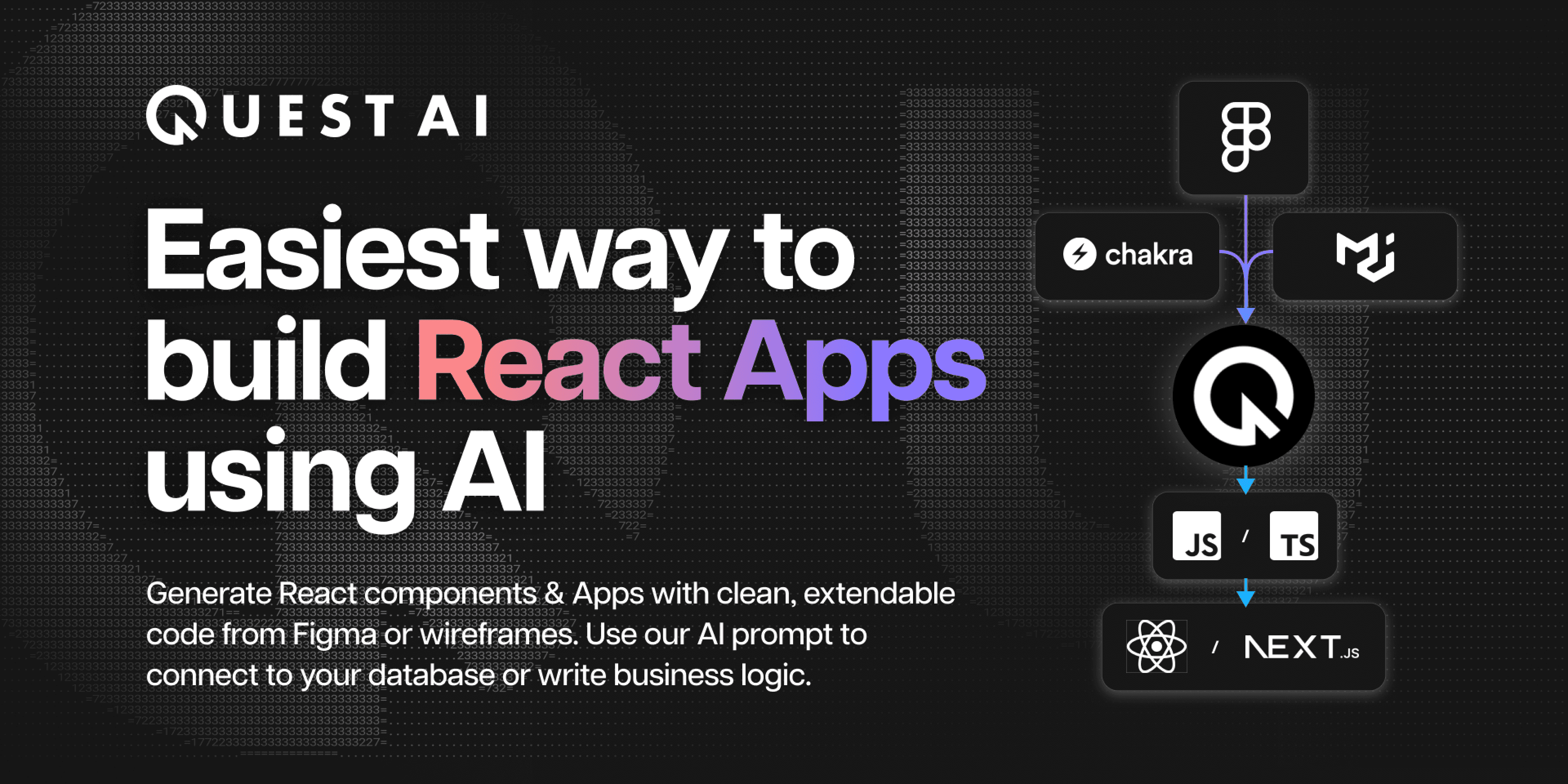
I created the messaging and visuals for all online channels. These examples come from the Figma community page for Quest but all social channels held the same message and look.
In this case, our early target audience was designers using Figma that wanted to deploy websites easily so I designed a clean, colorful and fun white brand design.
Later, we focused purely on developers so our style became more technical and dark to appeal specifically to that audience’s preferred styling.
VIDEO
VIDEO
One of our PLG marketing efforts included creating video demos and tutorials. I would write the scripts, record the videos and put everything together in After Effects. I often did the voice overs as well. These were often made as milestone videos to give a full tour of the product but also we would make a new video to showcases newly released features.
One of our PLG marketing efforts included creating video demos and tutorials. I would write the scripts, record the videos and put everything together in After Effects. I often did the voice overs as well. These were often made as milestone videos to give a full tour of the product but also we would make a new video to showcases newly released features.
One of our PLG marketing efforts included creating video demos and tutorials. I would write the scripts, record the videos and put everything together in After Effects. I often did the voice overs as well. These were often made as milestone videos to give a full tour of the product but also we would make a new video to showcases newly released features.
PRODUCT UPDATES
PRODUCT UPDATES
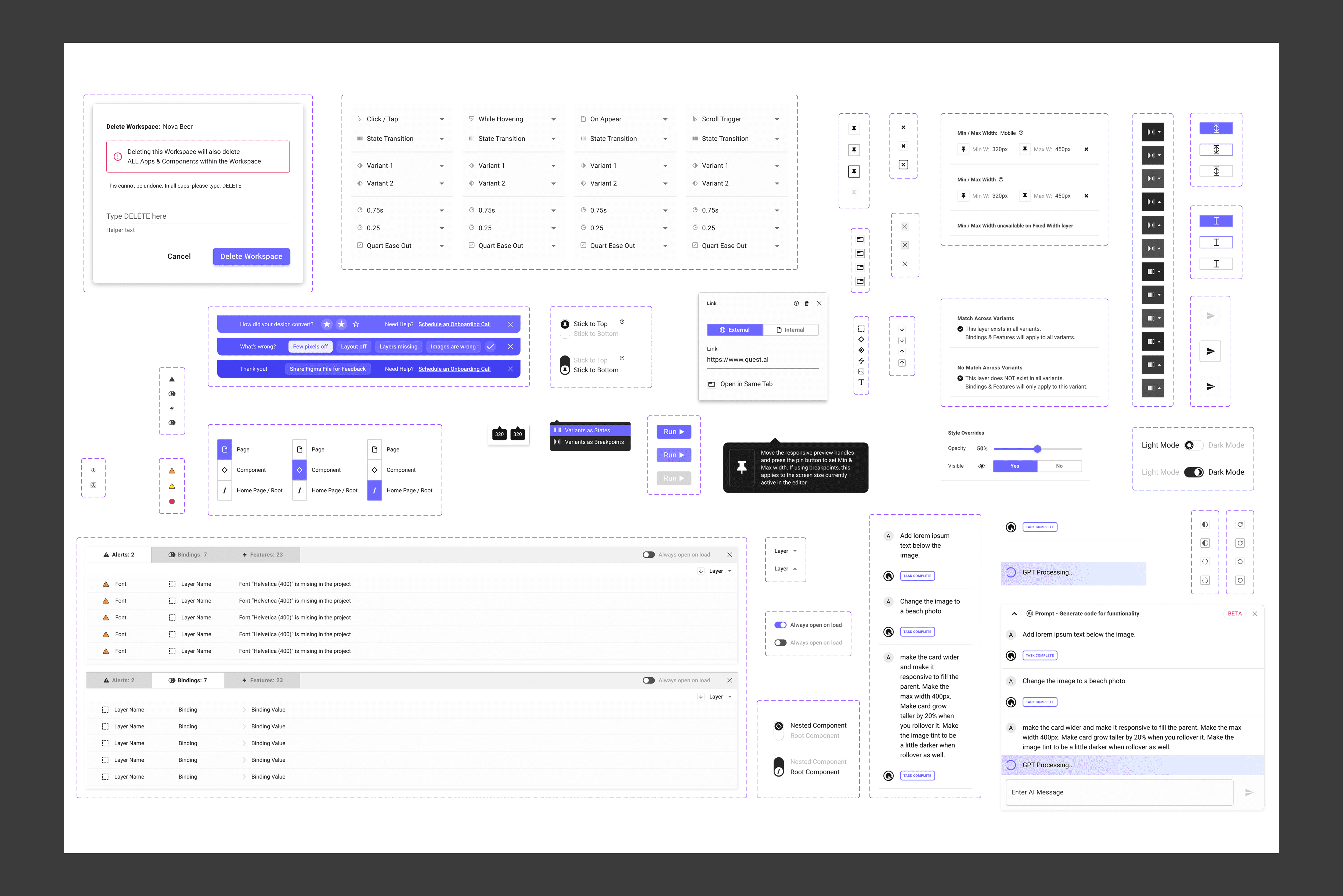
When a new product update was released, we had an onboarding pop-up to showcase all the new features to new and old users. This current iteration of the “What’s New” slides were targeted at our designer users. This later changed to be more subtle in a simple dialog box with bullet points targeting our developer users.
When a new product update was released, we had an onboarding pop-up to showcase all the new features to new and old users. This current iteration of the “What’s New” slides were targeted at our designer users. This later changed to be more subtle in a simple dialog box with bullet points targeting our developer users.
When a new product update was released, we had an onboarding pop-up to showcase all the new features to new and old users. This current iteration of the “What’s New” slides were targeted at our designer users. This later changed to be more subtle in a simple dialog box with bullet points targeting our developer users.
More Work


FIGMA PORTFOLIO
FIGMA PORTFOLIO
To view my work in Figma: https://tinyurl.com/yesjasper
A
A
N
N
D
D
R
R
E
E
W
W
J
J
A
A
S
S
P
P
E
E
R
R
UI/UX PRODUCT DESIGNER
UI/UX PRODUCT
DESIGNER

andyjasper@gmail.com
andyjasper@gmail.com
andyjasper@gmail.com
201.615.3861
201.615.3861
201.615.3861
©2023 Andrew Jasper
Site designed and developed by Jasper. All Rights Reserved.