QUEST AI - DESIGN SYSTEM
QUEST AI - DESIGN SYSTEM
QUEST AI - DESIGN SYSTEM
2023
2023
2023
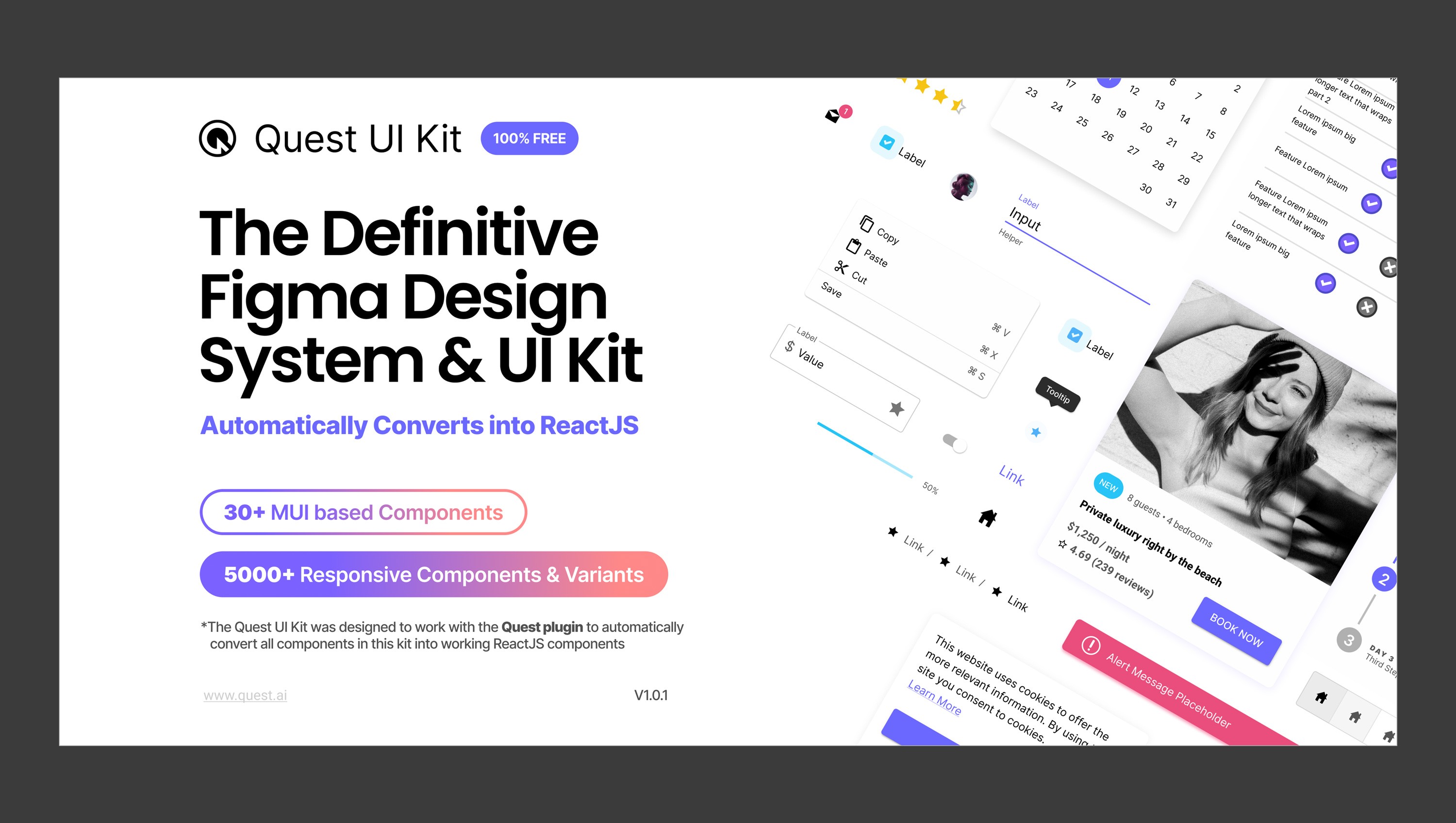
The definitive (Free) Figma Design System & UI Kit
The definitive (Free) Figma Design System & UI Kit
The definitive (Free) Figma Design System & UI Kit
See More
See More
See More
This Design System was a project that I spear-headed and designed completely on my own at Quest AI.
To help customers build and launch products faster, we set out to create our of design system and component library.
In addition to all the components that were derived from MUI, we added templates for Applications, Marketing, and E-commerce that used the design system components.
Overall the project took roughly 4 months to complete design and another 1 month to code.
Here I’m showcasing some examples pages from the UI Kit but you can click the link below to see it in the Figma Community.
Company
Company
Quest AI
Quest AI
Time
Time
4 months - 2023
4 months - 2023
Skills
Skills
Product Design
Production
UI / UX
Tools
Tools
Figma
Figma
Asana
Asana
Discord
Discord
PROBLEM
When Quest began, to set ourselves apart from the competitors, we wanted to support design systems and component libraries in order to convert complex, professional Figma designs into React code.
In order to support this from a design perspective, we decided to support the official Figma kit for MUI with both the community (free version) and the full kit (paid version). At initial glance, this was working for our early customers but it came with the trade-off of several hoops customers had to jump through. After several customer conversations over 6 month period alert launching our MVP, we uncovered some reoccurring pain points that we documented.
PHASE 1 - RESEARCH
CUSTOMER RESEARCH
Using Quest to convert frontend design (Figma) into React code was resonating with our target users. But through our analysis of our analytics (Mixpanel), we discovered that only a small portion of our users were using the design system itself. This discovered prompted us to reassess the current solution we were offering.
Using Quest to convert frontend design (Figma) into React code was resonating with our target users. But through our analysis of our analytics (Mixpanel), we discovered that only a small portion of our users were using the design system itself. This discovered prompted us to reassess the current solution we were offering.
Using Quest to convert frontend design (Figma) into React code was resonating with our target users. But through our analysis of our analytics (Mixpanel), we discovered that only a small portion of our users were using the design system itself. This discovered prompted us to reassess the current solution we were offering.
Friction and pain points with the early MUI solution:
Friction and pain points with the early MUI solution:
Friction and pain points with the early MUI solution:
The free version for our customers was limited in their ability to customize their design system. Not all "tokens" were available and customer would really need to pay for the full kit to make good use of our own platform.
MUI full version, while cheap in the grand scheme, was a hefty $79 per user license. This lead to customer drop-off as they couldn't truly experience the full value of our own product without making that investment.
We actually began to have a good working relationship with the founders of MUI, and they were kind enough to give us 2 weeks in advance for any design kit updates. However, we were not apart of their design decisions, and releases could come at any time with any unknown changes (though they did their best to document them to us). This lead to a lot of dependencies on their work and often led to confusion as we would not be able to keep up with new versions at the same time they would release new versions of their kit.
USER INTERVIEWS
User interviews were conducted with our "pro" user group that we knew were highly active with multiple team members per account. We conducted 6 interviews with individuals ranging from ages 23-45, each lasting 30-40 minutes long. The interviews were conducted through Zoom calls where we let them share their screens to show what issues they have been having and later in the call I would preview parts of the Figma design system I was working on to get feedback.
User interviews were conducted with our "pro" user group that we knew were highly active with multiple team members per account. We conducted 6 interviews with individuals ranging from ages 23-45, each lasting 30-40 minutes long. The interviews were conducted through Zoom calls where we let them share their screens to show what issues they have been having and later in the call I would preview parts of the Figma design system I was working on to get feedback.
User interviews were conducted with our "pro" user group that we knew were highly active with multiple team members per account. We conducted 6 interviews with individuals ranging from ages 23-45, each lasting 30-40 minutes long. The interviews were conducted through Zoom calls where we let them share their screens to show what issues they have been having and later in the call I would preview parts of the Figma design system I was working on to get feedback.
SURVEYS
Because some users can be reluctant to jump on a call during busy periods, we also sent out a survey via Typeform. The survey contained roughly 10 multiple choice questions with options to add their own details. This helped us discover that they did indeed feel the price overall for the MUI kit was fair if they were committed to using Quest but made it difficult to see our value without paying.
Because some users can be reluctant to jump on a call during busy periods, we also sent out a survey via Typeform. The survey contained roughly 10 multiple choice questions with options to add their own details. This helped us discover that they did indeed feel the price overall for the MUI kit was fair if they were committed to using Quest but made it difficult to see our value without paying.
Because some users can be reluctant to jump on a call during busy periods, we also sent out a survey via Typeform. The survey contained roughly 10 multiple choice questions with options to add their own details. This helped us discover that they did indeed feel the price overall for the MUI kit was fair if they were committed to using Quest but made it difficult to see our value without paying.
PHASE 2 - Design & BUILD
PLANNING
To start the process, we looked at feedback from customers about their most needed components. By understanding the types of projects they were designing in Figma to then build in React, it helped us hone in on what components we needed to support. We knew we were not going to support every MUI component there was available but we wanted to be sure it solved 90% of customers use cases and that we'd fill in the gaps in later sprints. In the end, we came up with a list of components and variants we needed.
We decided to do about 30 components. We omitted some components that customers never brought up, some that were easy to build without a design system, and others that were too complex to build on our own backend for version 1 such as Calendar and Data Grid.
Additionally, we made the easy choice to provide this kit entirely for free to anyone that needed it (not just Quest users). We wanted to reduce all friction to using it as we understood it was a time investment, on the user's part, just to be starting on a design system from scratch.
The full list of supported components is here in the documentation with instructions and best practices: Quest UI Kit Docs.
To start the process, we looked at feedback from customers about their most needed components. By understanding the types of projects they were designing in Figma to then build in React, it helped us hone in on what components we needed to support. We knew we were not going to support every MUI component there was available but we wanted to be sure it solved 90% of customers use cases and that we'd fill in the gaps in later sprints. Th
To start the process, we looked at feedback from customers about their most needed components. By understanding the types of projects they were designing in Figma to then build in React, it helped us hone in on what components we needed to support. We knew we were not going to support every MUI component there was available but we wanted to be sure it solved 90% of customers use cases and that we'd fill in the gaps in later sprints. Th
DESIGN
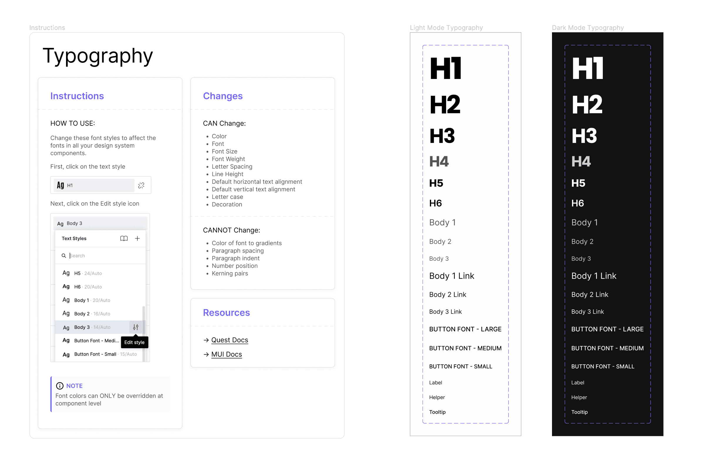
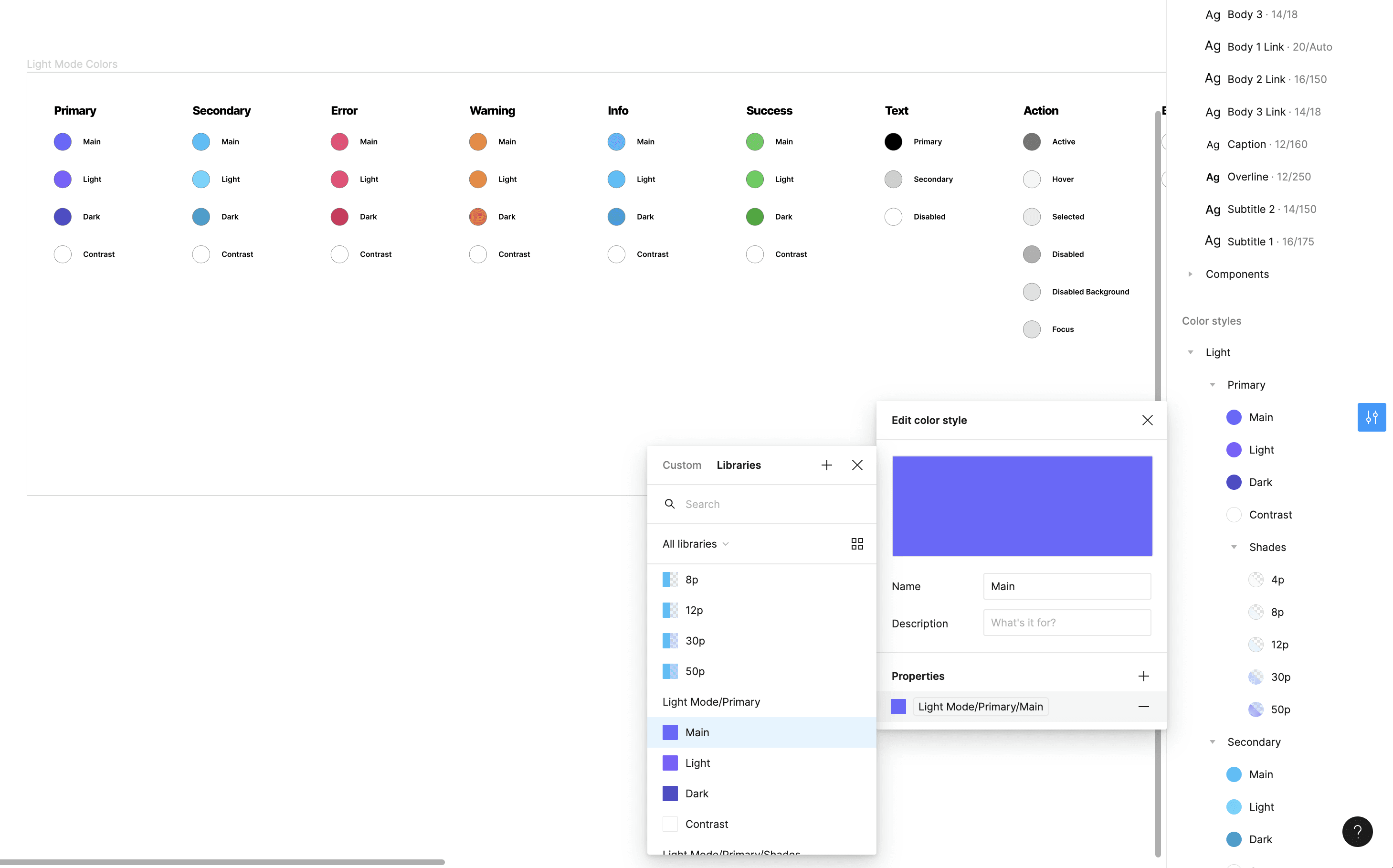
To begin designing the kit in Figma, I first set out to establish the fonts, colors and effects that would be used as styles in Figma for users to later easily replace. By looking at what MUI standard fonts were, I created text styles to match and gave my own font treatment to match our Quest brand. Next, I did the same with colors, finding the sets of colors that were used in the MUI theme and created styles for all of them. Similarly, I did this for drop-shadows as well for things like button and card components.
I began by building some more well known components such as button, alert and avatar. This helped me start to see where I needed to add atoms to the component library as well. For instance, I need to make an icon component / atom for icons in alert and avatar. Icons proved the most tricky part of the process, because while easy to design, we quickly discovered a lot of technical limitations of allowing a user to use any custom icon they wanted. We ended up reverting the idea of allowing customers the ability to modify or create new icons and stuck directly with the MUI icon library icons only because of issues with SVG rendering and unforeseen light/dark mode issues.
To start the process, we looked at feedback from customers about their most needed components. By understanding the types of projects they were designing in Figma to then build in React, it helped us hone in on what components we needed to support. We knew we were not going to support every MUI component there was available but we wanted to be sure it solved 90% of customers use cases and that we'd fill in the gaps in later sprints. Th
To start the process, we looked at feedback from customers about their most needed components. By understanding the types of projects they were designing in Figma to then build in React, it helped us hone in on what components we needed to support. We knew we were not going to support every MUI component there was available but we wanted to be sure it solved 90% of customers use cases and that we'd fill in the gaps in later sprints. Th
Build
Because the design system was directly linked to what Quest does, every component that we supported needed to be able to convert the Figma version into a React version through the use of the Quest AI plugin. This obviously made set up more meticulous than just designing it in Figma our own needs, every single layer needed to be named properly, responsive where necessary, and styled in a convention that matched MUI's own standards.
Because the design system was directly linked to what Quest does, every component that we supported needed to be able to convert the Figma version into a React version through the use of the Quest AI plugin. This obviously made set up more meticulous than just designing it in Figma our own needs, every single layer needed to be named properly, responsive where necessary, and styled in a convention that matched MUI's own standards.
Because the design system was directly linked to what Quest does, every component that we supported needed to be able to convert the Figma version into a React version through the use of the Quest AI plugin. This obviously made set up more meticulous than just designing it in Figma our own needs, every single layer needed to be named properly, responsive where necessary, and styled in a convention that matched MUI's own standards.
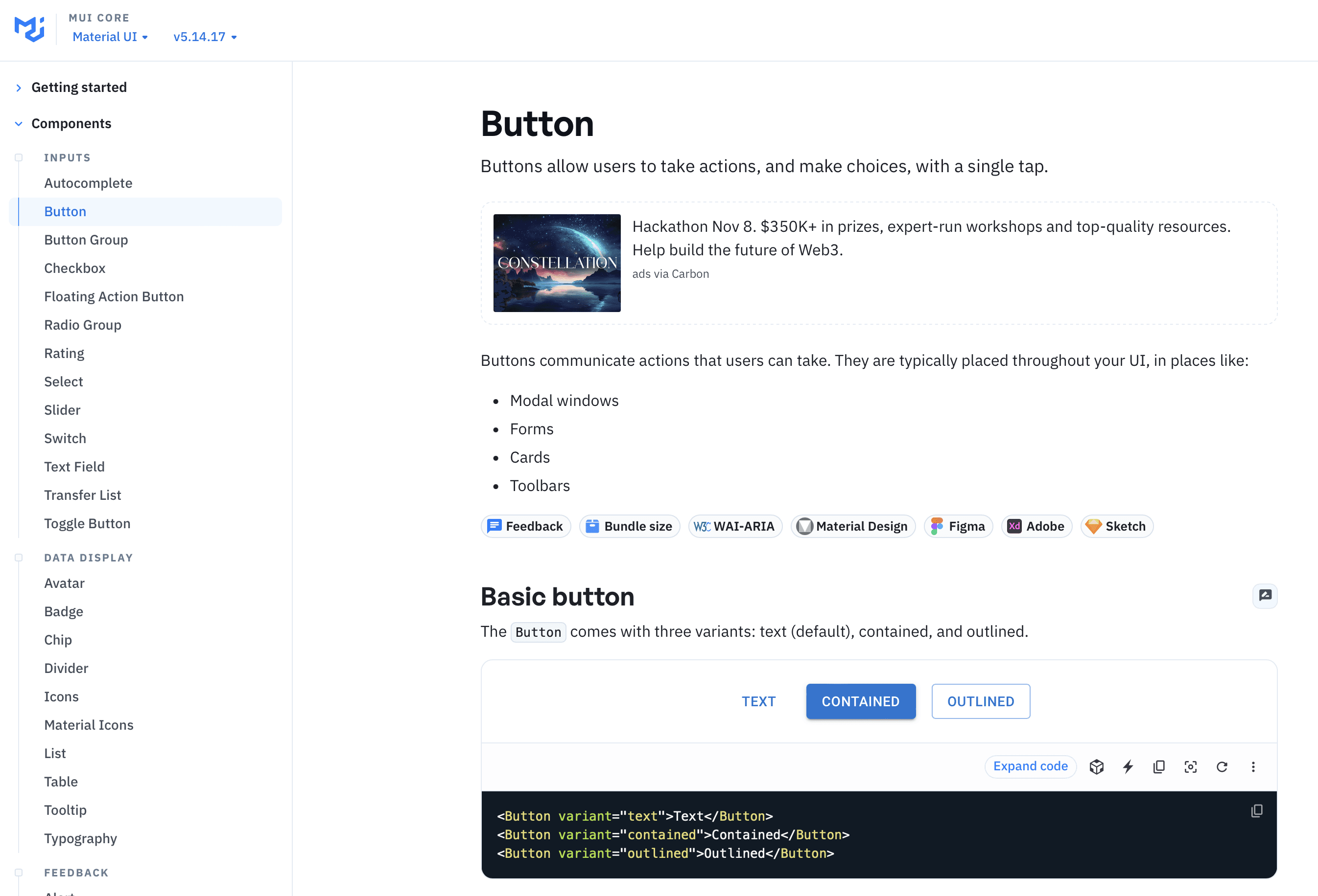
By looking through the MUI docs, we were able to start to identify all the different parameters that were included in each component so that we could included them, properly named as properties in the Figma component and variants. For instance, for button, we decided to support all 3 button variants for "text", "contained" and "outlined".
By looking through the MUI docs, we were able to start to identify all the different parameters that were included in each component so that we could included them, properly named as properties in the Figma component and variants. For instance, for button, we decided to support all 3 button variants for "text", "contained" and "outlined".
By looking through the MUI docs, we were able to start to identify all the different parameters that were included in each component so that we could included them, properly named as properties in the Figma component and variants. For instance, for button, we decided to support all 3 button variants for "text", "contained" and "outlined".
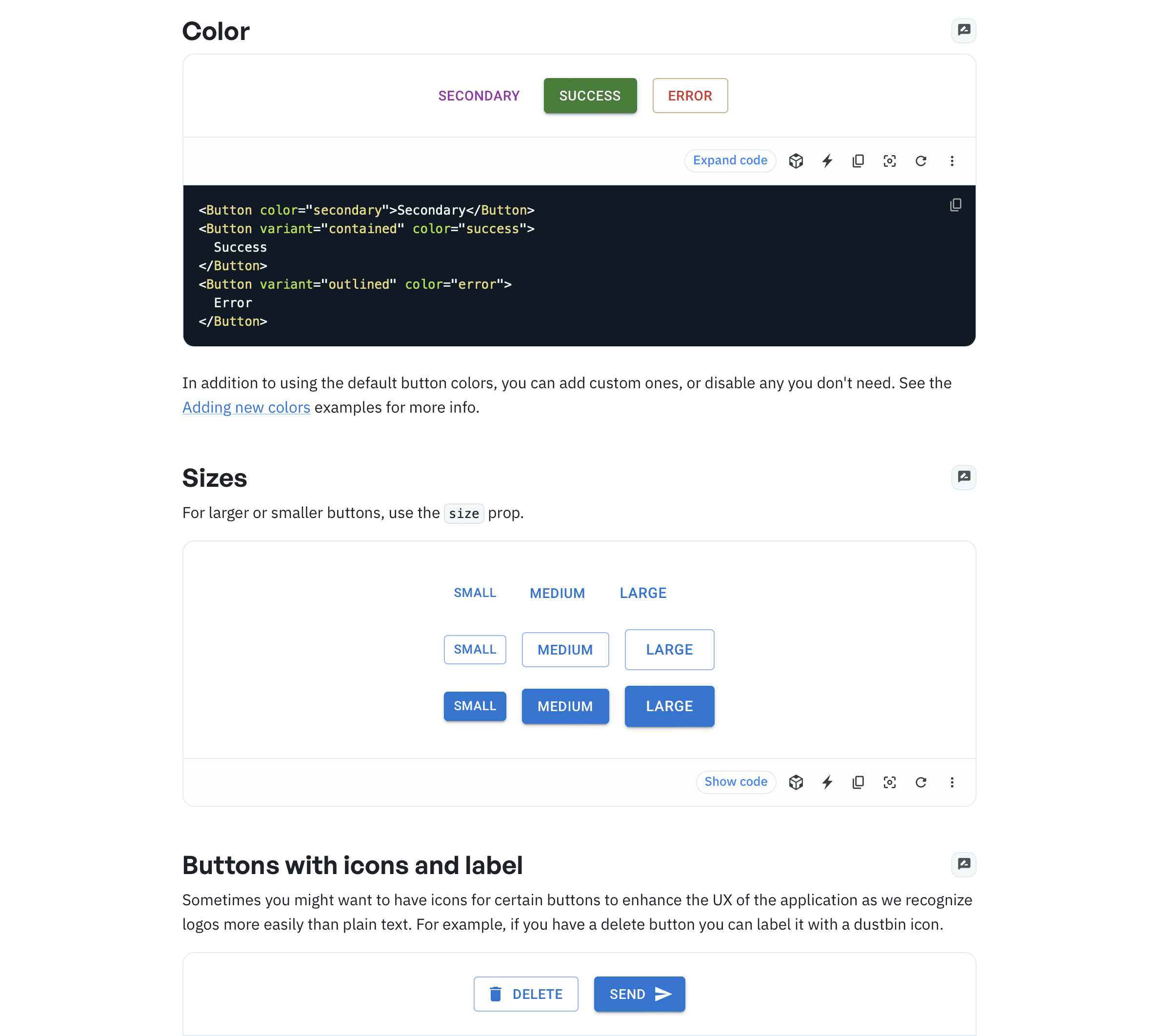
By seeing what options were enabled for what components in MUI, we started to record that into a database that would later be used for the base logic of our conversion system. Did the button have an icon and on which side? Was it a primary color medium size solid button? These combinations would end up giving the button component hundreds of variants, but all distilled down to what would be the most important variants for customer use and trimming any corner cases in order to save time on programming and support.
By seeing what options were enabled for what components in MUI, we started to record that into a database that would later be used for the base logic of our conversion system. Did the button have an icon and on which side? Was it a primary color medium size solid button? These combinations would end up giving the button component hundreds of variants, but all distilled down to what would be the most important variants for customer use and trimming any corner cases in order to save time on programming and support.
By seeing what options were enabled for what components in MUI, we started to record that into a database that would later be used for the base logic of our conversion system. Did the button have an icon and on which side? Was it a primary color medium size solid button? These combinations would end up giving the button component hundreds of variants, but all distilled down to what would be the most important variants for customer use and trimming any corner cases in order to save time on programming and support.
PHASE 3 - PUBLISH TO FIGMA COMMUNITY
RESULTS
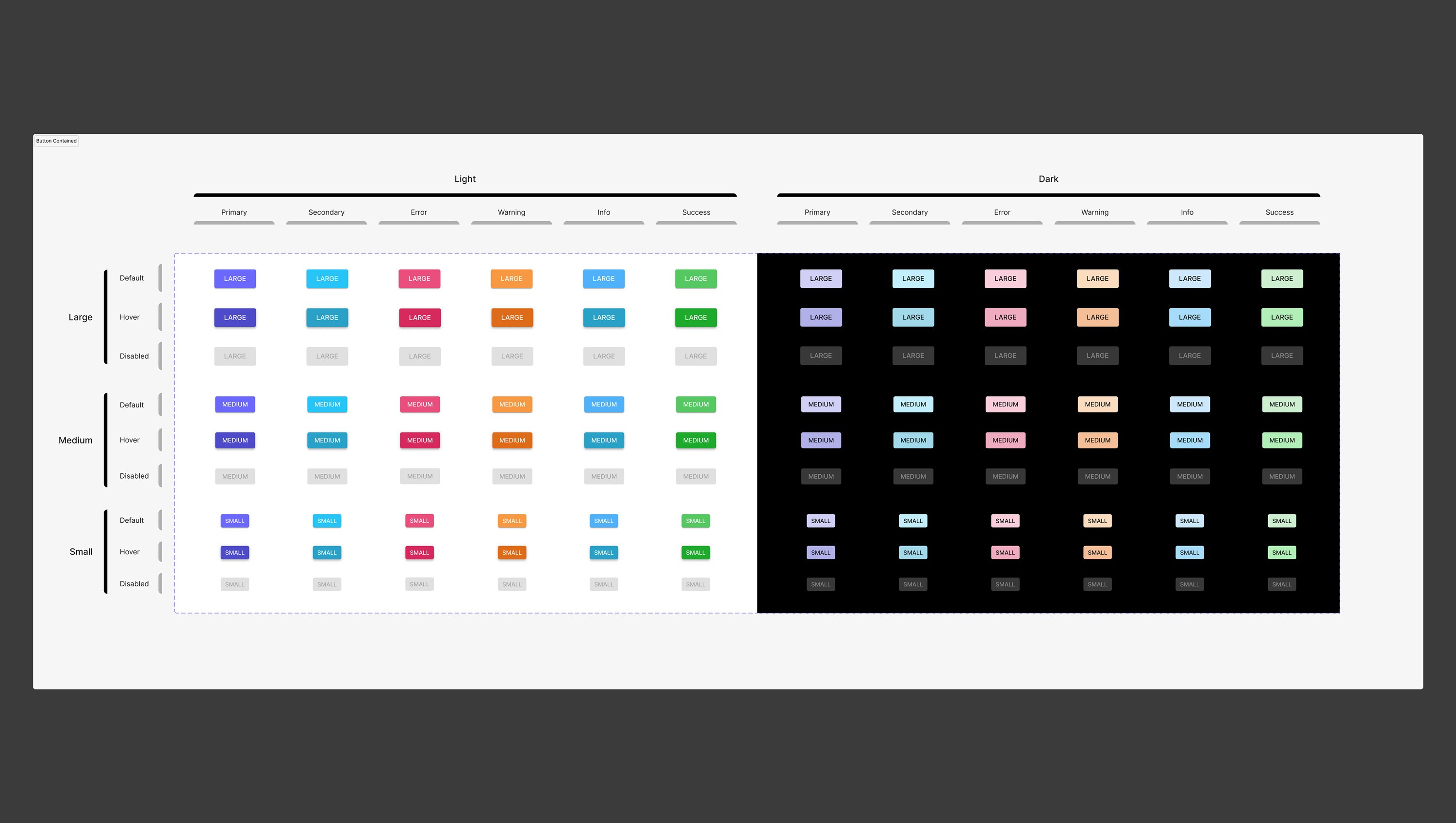
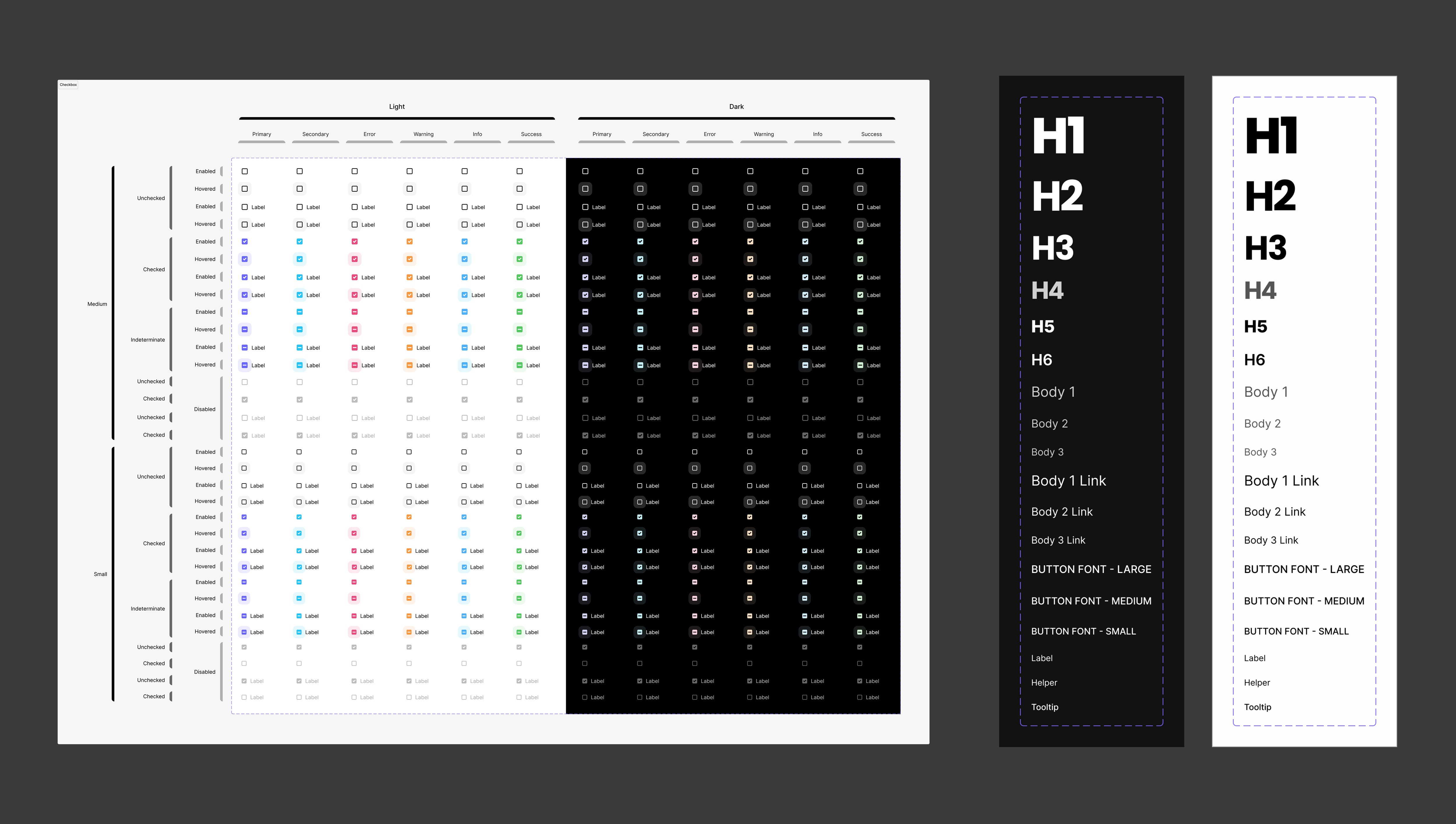
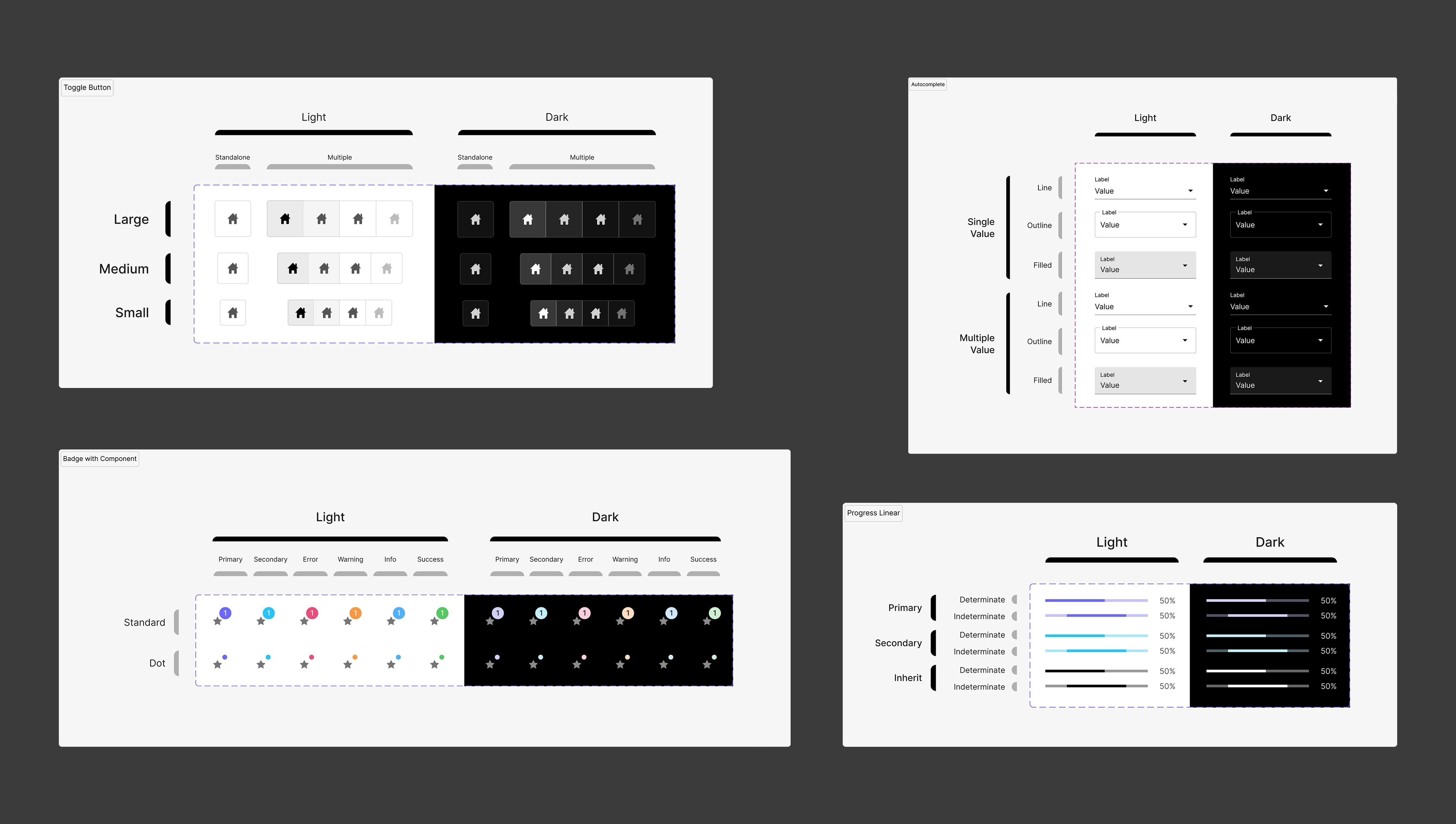
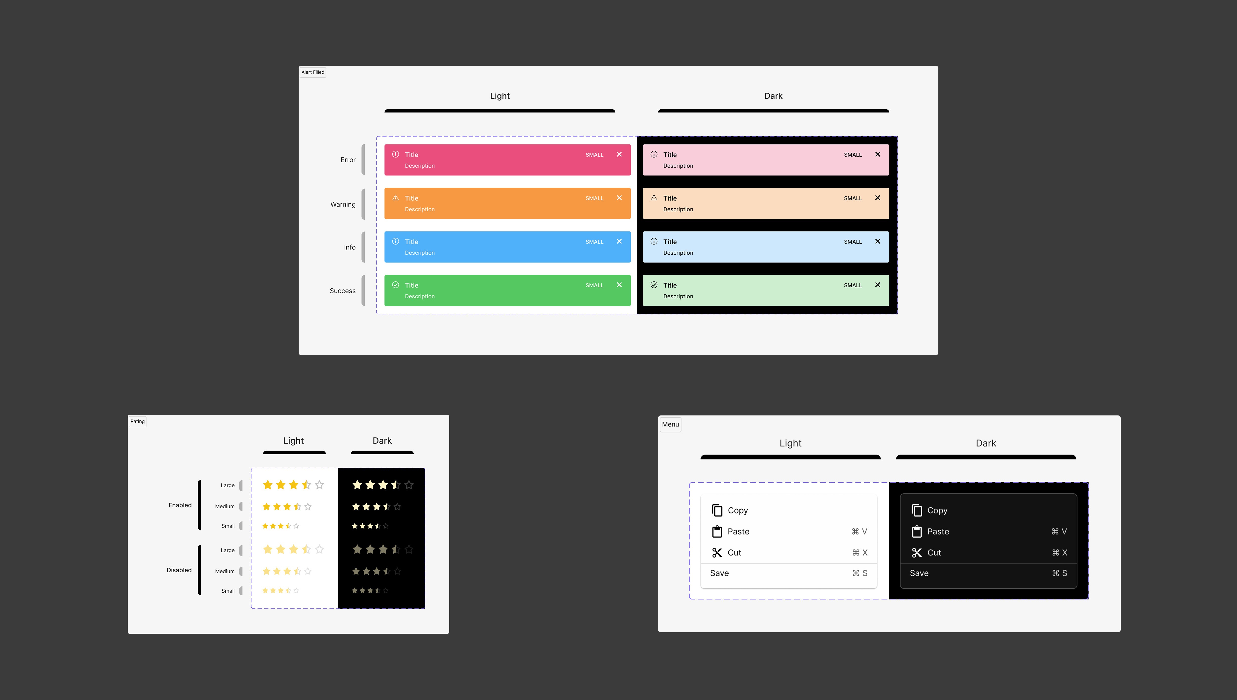
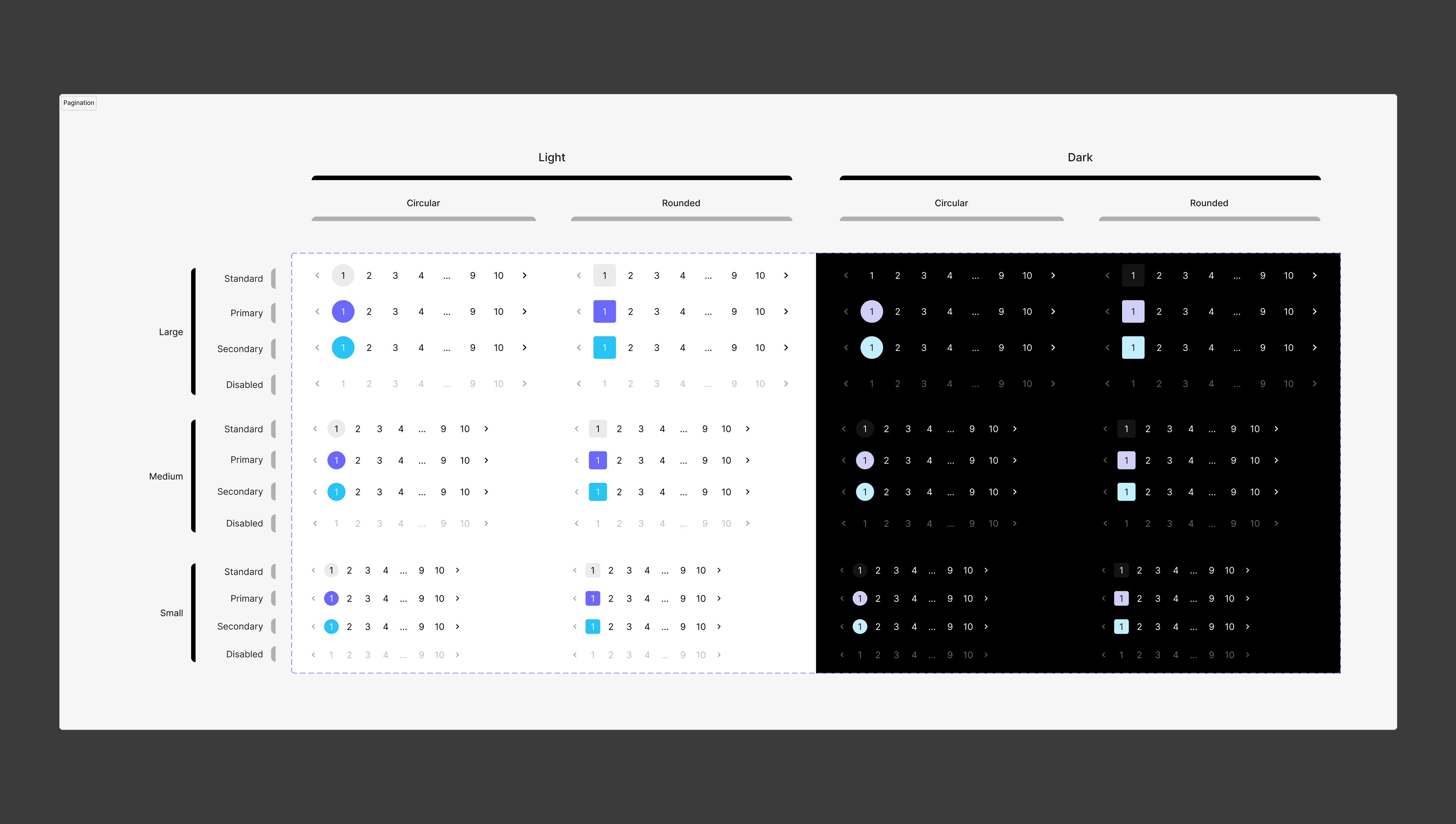
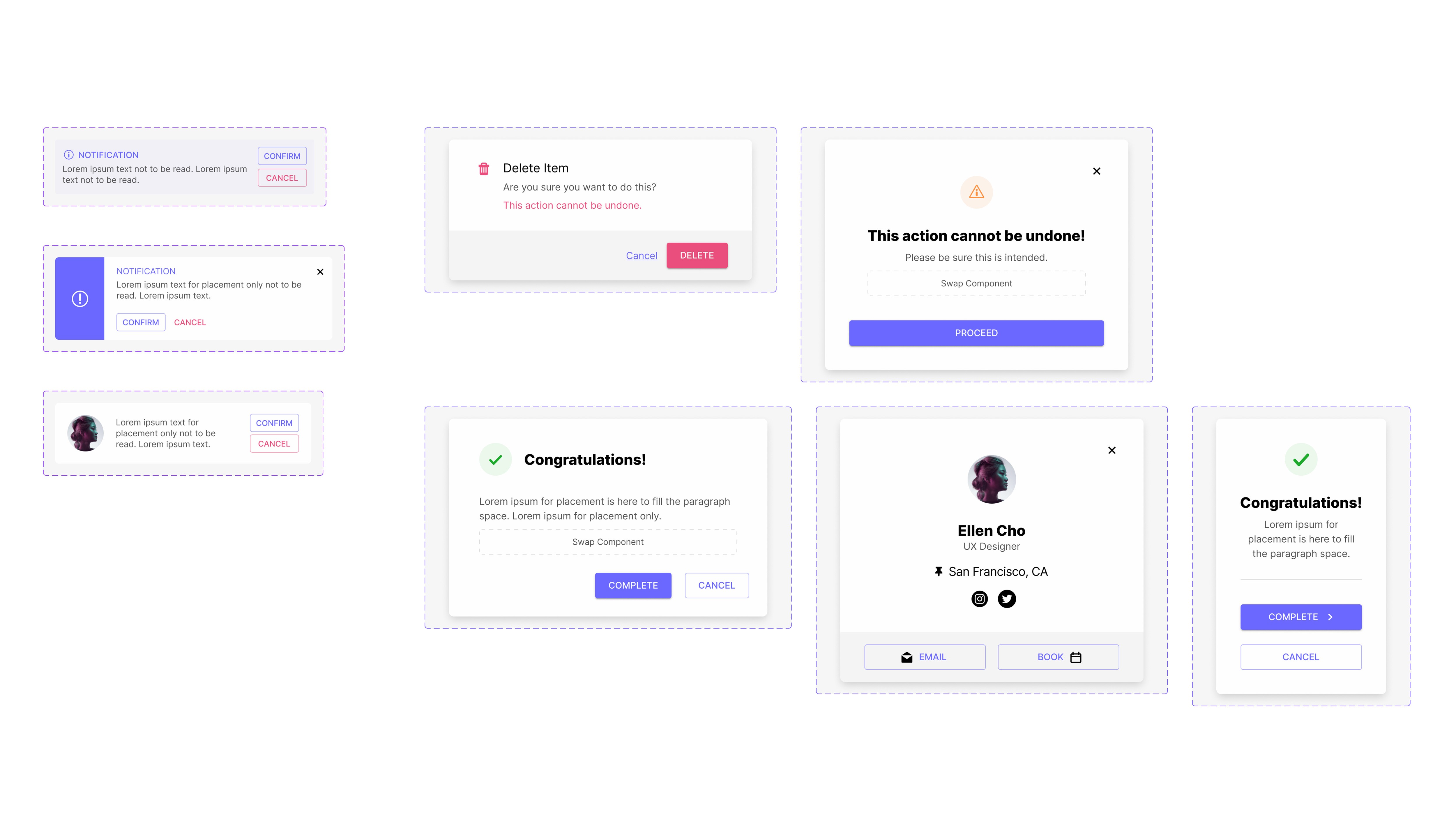
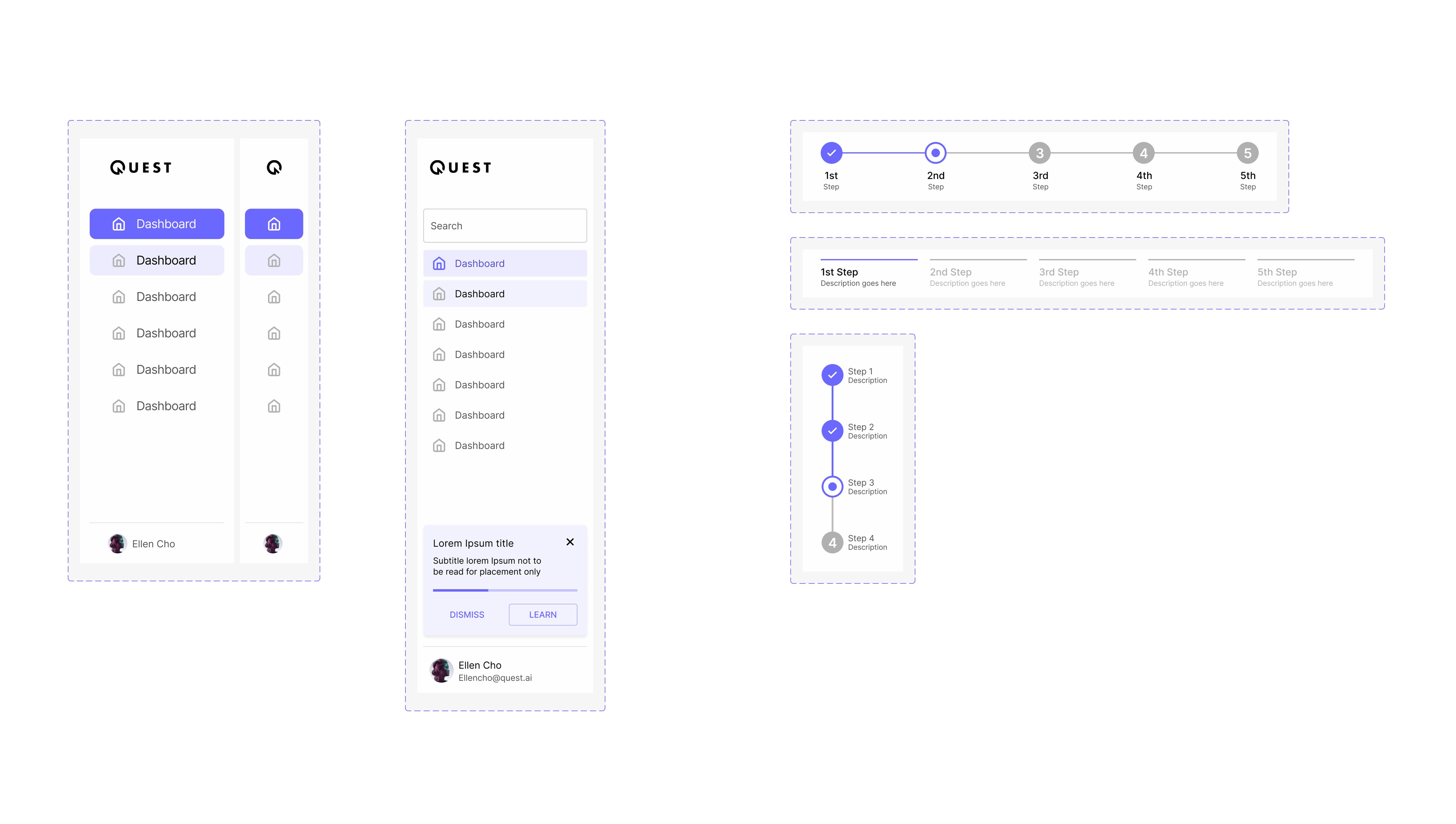
In the end we supported 30+ MUI library components based on atomic design with around 15 atomic components as the bones of the design system. Additionally, I created and used 150+ variables in addition to about 200 styles. This helped the customers to very easily customize things and the styles for fonts and colors matched the standards defined by the MUI library.
In addition to the design system, we also started to create dozens of templates in the UI Kit as well. This was more straightforward from a technical standpoint as I utilized the styles and components to make up the templates themselves. I was able to produce about 100 components in the process of waiting for my development team to finish the backend work needed for the component library.
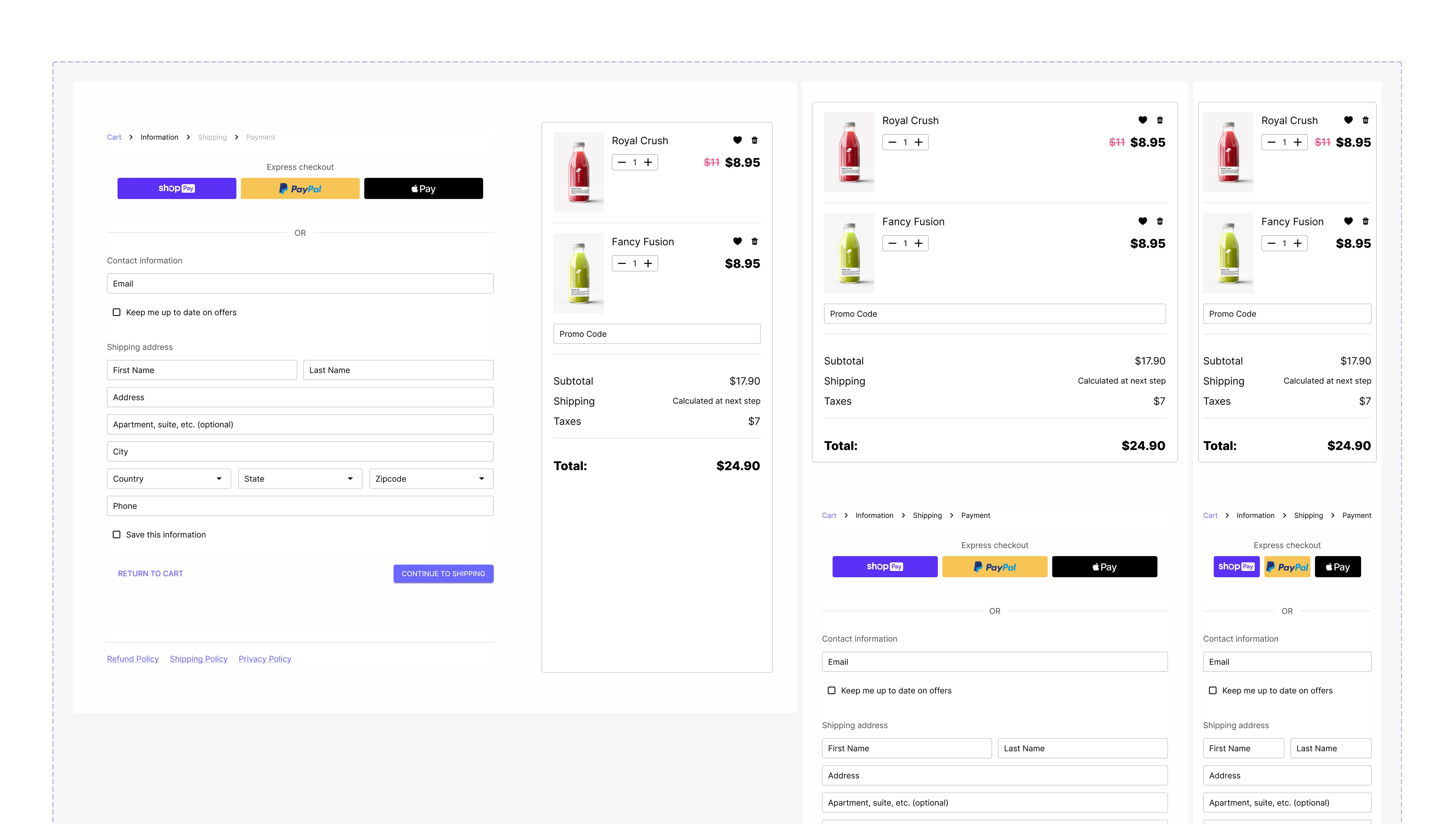
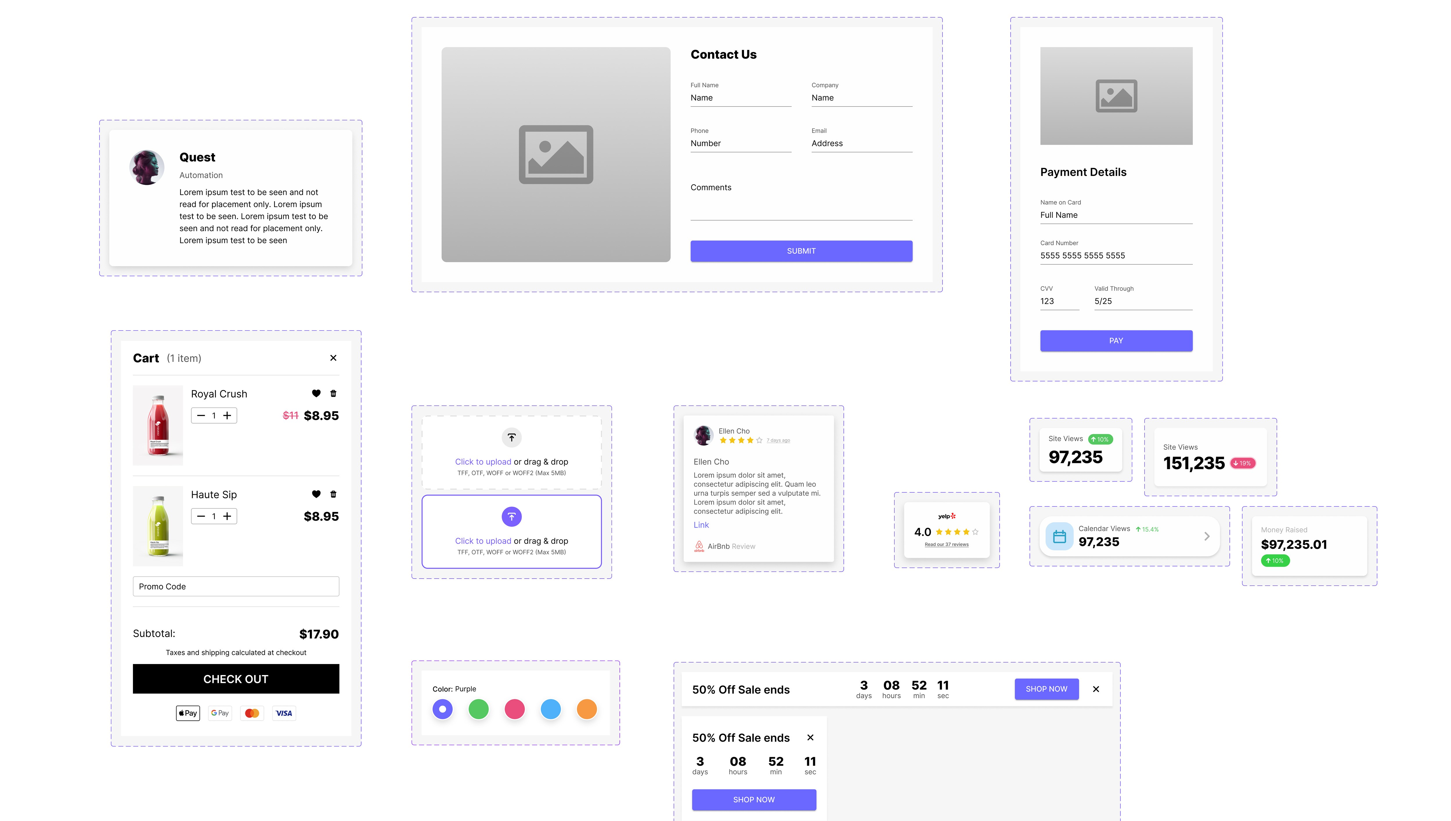
Below are some screenshots of the design system and UI Kit but you can check out the links as well to see it directly in Figma and make a copy for yourself.
You can see and use the this free Quest UI Kit here.
You can check out the Quest website to learn more.
In the end we supported 30+ MUI library components based on atomic design with around 15 atomic components as the bones of the design system. Additionally, I created and used 150+ variables in addition to about 200 styles. This helped the customers to very easily customize things and the styles for fonts and colors matched the standards defined by the MUI library.
In addition to the design system, we also started to create dozens of templates in the UI Kit as well. This was more straightforward from a technical standpoint as I utilized the styles and components to make up the templates themselves. I was able to produce about 100 components in the process of waiting for my development team to finish the backend work needed for the component library.
Below are some screenshots of the design system and UI Kit but you can check out the links as well to see it directly in Figma and make a copy for yourself.
You can see and use the this free Quest UI Kit here.
You can check out the Quest website to learn more.
COMPONENTS
COMPONENTS
TEMPLATES
TEMPLATES
More Work


FIGMA PORTFOLIO
FIGMA PORTFOLIO
To view my work in Figma: https://tinyurl.com/yesjasper
A
A
N
N
D
D
R
R
E
E
W
W
J
J
A
A
S
S
P
P
E
E
R
R
UI/UX PRODUCT DESIGNER
UI/UX PRODUCT
DESIGNER

©2023 Andrew Jasper
Site designed and developed by Jasper. All Rights Reserved.