APPLE - GENIUS TRAINING
APPLE - GENIUS TRAINING
2016
2016
2016
See More


GOAL
At the start of 2016, while working at Apple in the Apple Care Media team, the VP of our division challenged us to increased engagement of Genius training because it was predicted it would decrease service/repair time. As design lead, I was tasked with coming up with a revamp to the existing design and improvements to the user experience.
At the start of 2016, while working at Apple in the Apple Care Media team, the VP of our division challenged us to increased engagement of Genius training because it was predicted it would decrease service/repair time. As design lead, I was tasked with coming up with a revamp to the existing design and improvements to the user experience.
Company
Company
Apple
Apple
Time
Time
9 months - 2016
9 months - 2016
Skills
Skills
Motion Design
Creative Direction
UI / UX
TEAM
I worked in Apple Support for the Apple Care team for close to 4 years. The team’s focus was crafting engaging training content (videos and still graphics) for Geniuses at Apple stores, many other teams utilized our skills and the 3 in-house studio spaces to produce content.
Before I started working with my team, the content delivery method for the support videos was simply to play a naked quicktime movie in a html page. That had to change.
ROLE
As Design Lead, I helped identify potential issues, designed a style guide for both the videos themselves as well as the delivery method, and oversaw the design and build of the team's new internal delivery website.
I worked with 3 other designers, 5 video editors and hired 1 web developer to work directly under me to implement the brand new site. The entire process took 9 months, start to finish.
PROCESS
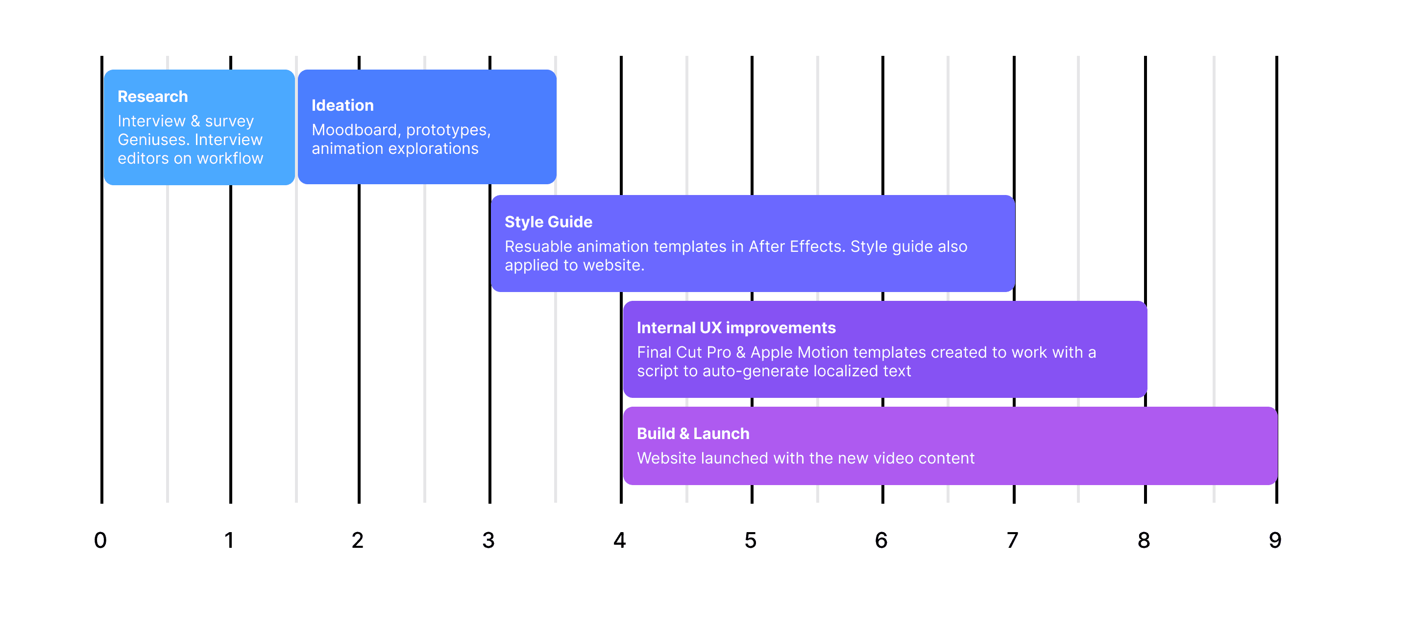
RESEARCH
In the initial phase, we were granted access to the Genius training facility where they would fly in newly promoted Geniuses from Apple Stores all over the country. They would go through a 2 week training course and myself and another team member presented for 10 minutes to about 10 classes to get feedback.
We showed new and old concepts and did some A/B testing to get feedback from our new audience. This helped us understand their thought process and gathered some interesting feedback because it was an in-person interview.
Additionally, I did 1-on-1 interviews with my own team's video editors to see if there were any improvements they thought could be done. During this process I discovered that localizing the content was one of the most brutal parts of the process and we'd higher almost 100% additional resources in peak months to simply copy and paste text in the right places.

IDEATION
During this phase, I started to experiment with visual improvements and animations. The older style for the team had no real direction aside from using a flat 1 color highlight. This was used and sometimes animated as a way to draw the eye to parts of the imagery and video recordings. There was little consistency and research showed everyone felt it looked dated.
I also created a new look for the pages themselves to bring the video’s style into a more modern time. This was close to around when Apple had refreshed their own brand with iOS7 and later the Apple Watch so I wanted to push what the visual identity of an internal product at Apple should look like.
STYLE GUIDE
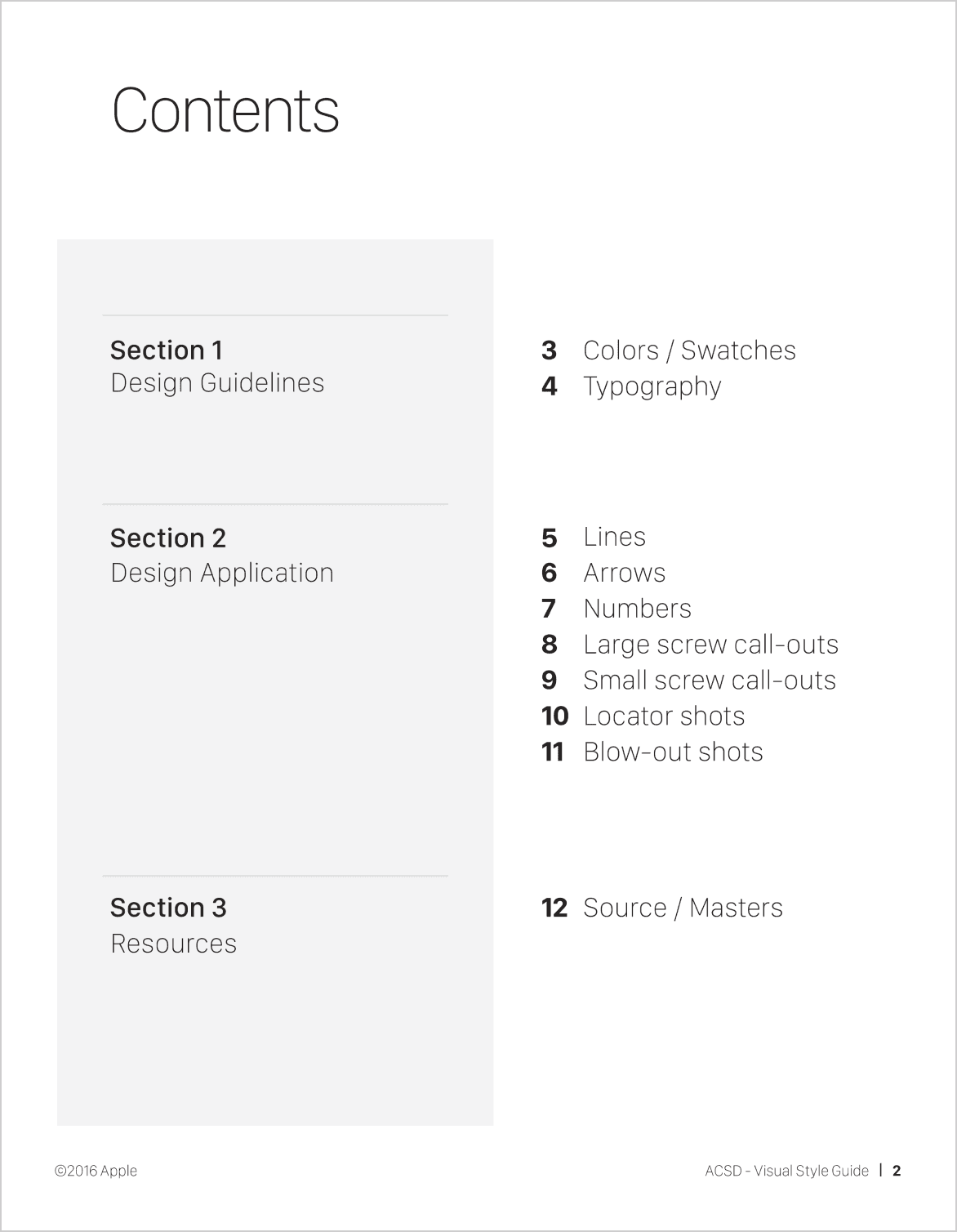
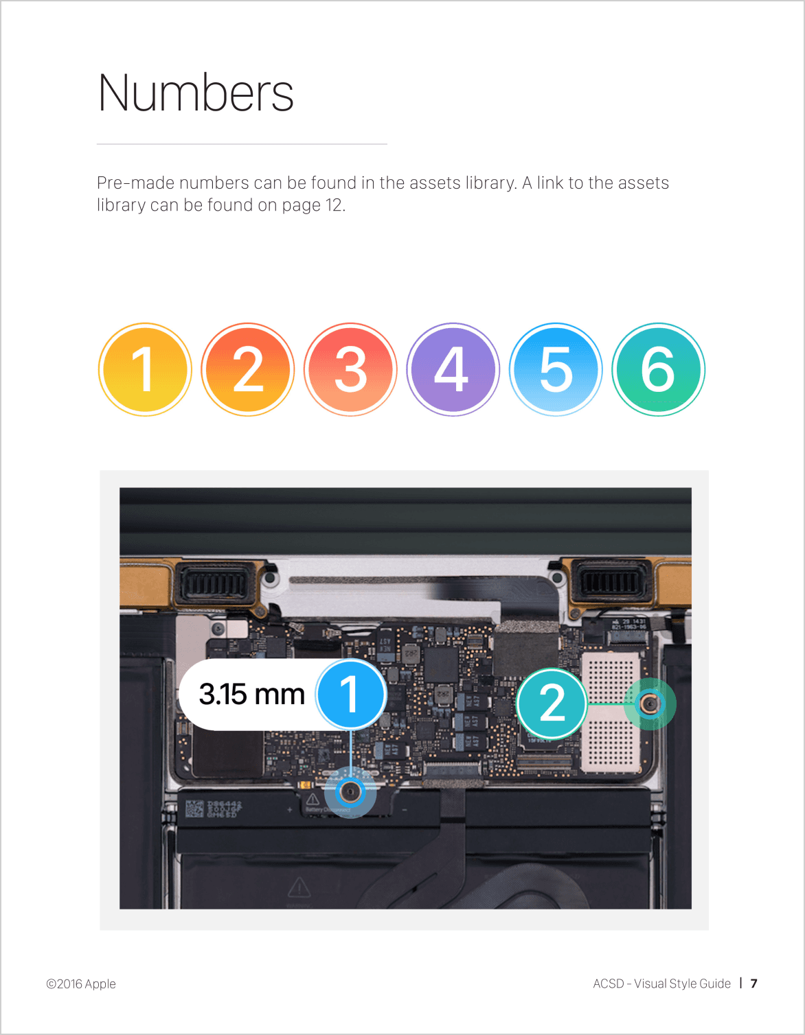
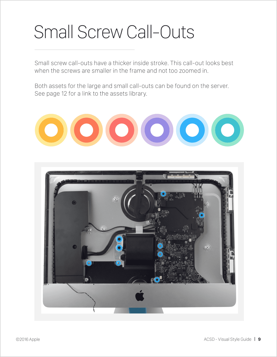
After a basic style was agreed upon for the motion graphic templates, I created a style guide for the motion team to follow. This way it ensured a consistent look and feel as well as being a refresh that felt on-brand to Apple. Because it was such a drastic departure, we had to have higher-ups approve which lead to a long approval time. However, because more eyes were on it, this style guide later served as the basis for several other Apple Service teams.
After a basic style was agreed upon for the motion graphic templates, I created a style guide for the motion team to follow. This way it ensured a consistent look and feel as well as being a refresh that felt on-brand to Apple. Because it was such a drastic departure, we had to have higher-ups approve which lead to a long approval time. However, because more eyes were on it, this style guide later served as the basis for several other Apple Service teams.


INTERNAL UX IMPROVEMENTS
Because our team's video content was distributed globally, we would send out all text and VO to a third-party vendor to give it back in the languages we required as an Excel doc. This doc was what editors would copy and paste from to make new language videos. Instead I used it with an AppleScript I wrote.
To solve for the pain point of localization, I created most of the new graphics with Apple Motion because it was easy for the video editing team to use them as templates. I made a localization AppleScript to work for the video editing team so they no longer had to copy and paste things for new languages; just run the script once and it exports all 13 language Final Cut files. This saved hundreds of hours having all motion graphic templates setup to work with the script.
I applied this same script to our new website as well. I used XML files to provided the content for each individual webpage and wrote an AppleScript to localize pages and locally save 13 localized HTML files.

BUILD & LAUNCH
While helped creating one-off motion graphics, most of the titles, lower 3rds, end caps, etc. were now templates. It freed me up to spend more time working with the developer I hired to design and iterate on the website itself. Because it needed to work on iPads (common in stores) and Macs, we designed it to be responsive and use a grid layout with Angular.
An additional challenge was we were no longer serving videos off a direct CDN so we needed to build out a new video player to match Apple standards. We ended up using Video.js on AWS instead of Akamai our previous network. After careful experiments, we found AWS produced the highest quality while still meeting an internal streaming budget.
-5
Contractors
hired
5X views
5X views
on average
2-3X
2-3X
Videos published
per quarter
RESULTS
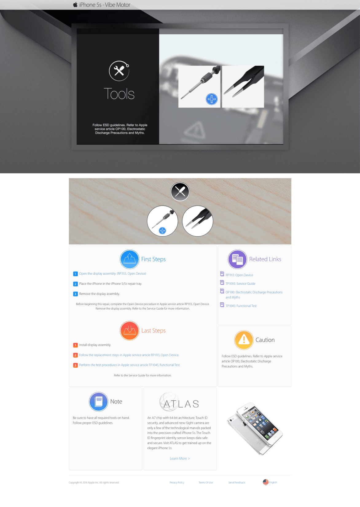
At the end, we launched a brand new website that was easy to navigate and was localized in 13 languages. Instead of a simple video, employees now were taken to an engaging website that had relevant information about the video such as what tools were required, thus reducing confusion and increased retention.
With the new internal localization setup, we actually hired 5 less contractors and still were able to produce more content than ever.
Below is an example of some of the webpages.


More Case Studies
A
A
N
N
D
D
R
R
E
E
W
W
J
J
A
A
S
S
P
P
E
E
R
R
UI/UX PRODUCT DESIGNER
UI/UX PRODUCT
DESIGNER
©2026 Andrew Jasper
Site designed and developed by Jasper. All Rights Reserved.


