DUNKIN' - INTERACTIVE CAMPAIGN
DUNKIN' - INTERACTIVE CAMPAIGN
DUNKIN' - INTERACTIVE CAMPAIGN
2019
2019
2019
See More
See More
See More


GOAL
In the fall of 2018, while working at GameCommerce, Dunkin' approached us to ask for an interactive experience for Halloween in order to better reach a younger audience on SnapChat (GameCommerce was a strategic partner with Snap). We were tasked with pitching concepts we believed would be fun and memorable with the KPIs being both reach and engagement.
In the fall of 2018, while working at GameCommerce, Dunkin' approached us to ask for an interactive experience for Halloween in order to better reach a younger audience on SnapChat (GameCommerce was a strategic partner with Snap). We were tasked with pitching concepts we believed would be fun and memorable with the KPIs being both reach and engagement.
In the fall of 2018, while working at GameCommerce, Dunkin' approached us to ask for an interactive experience for Halloween in order to better reach a younger audience on SnapChat (GameCommerce was a strategic partner with Snap). We were tasked with pitching concepts we believed would be fun and memorable with the KPIs being both reach and engagement.
Company
Company
GameCommerce
GameCommerce
Time
Time
6 weeks - 2019
6 weeks - 2019
Skills
Skills
Interaction Direction
UI / UX
Interaction Direction
UI / UX
Interaction Direction
UI / UX
ROLE
As Head of Design, I was tasked with both coming up with concepts to meet the client's goals. I was also responsible for the visual design, UI and UX. I created wireframes, pitched the ideas in a meeting and 15 Dunkin' stakeholders, oversaw the high-fidelity final graphics and animations, was the internal stakeholder for final experience approval.
I worked with 1 designer for game graphics and 1 developer who implemented the game logic and experience deployment. I chose the sound effects and music from a library to stay on budget.
PROCESS

WIREFRAMES
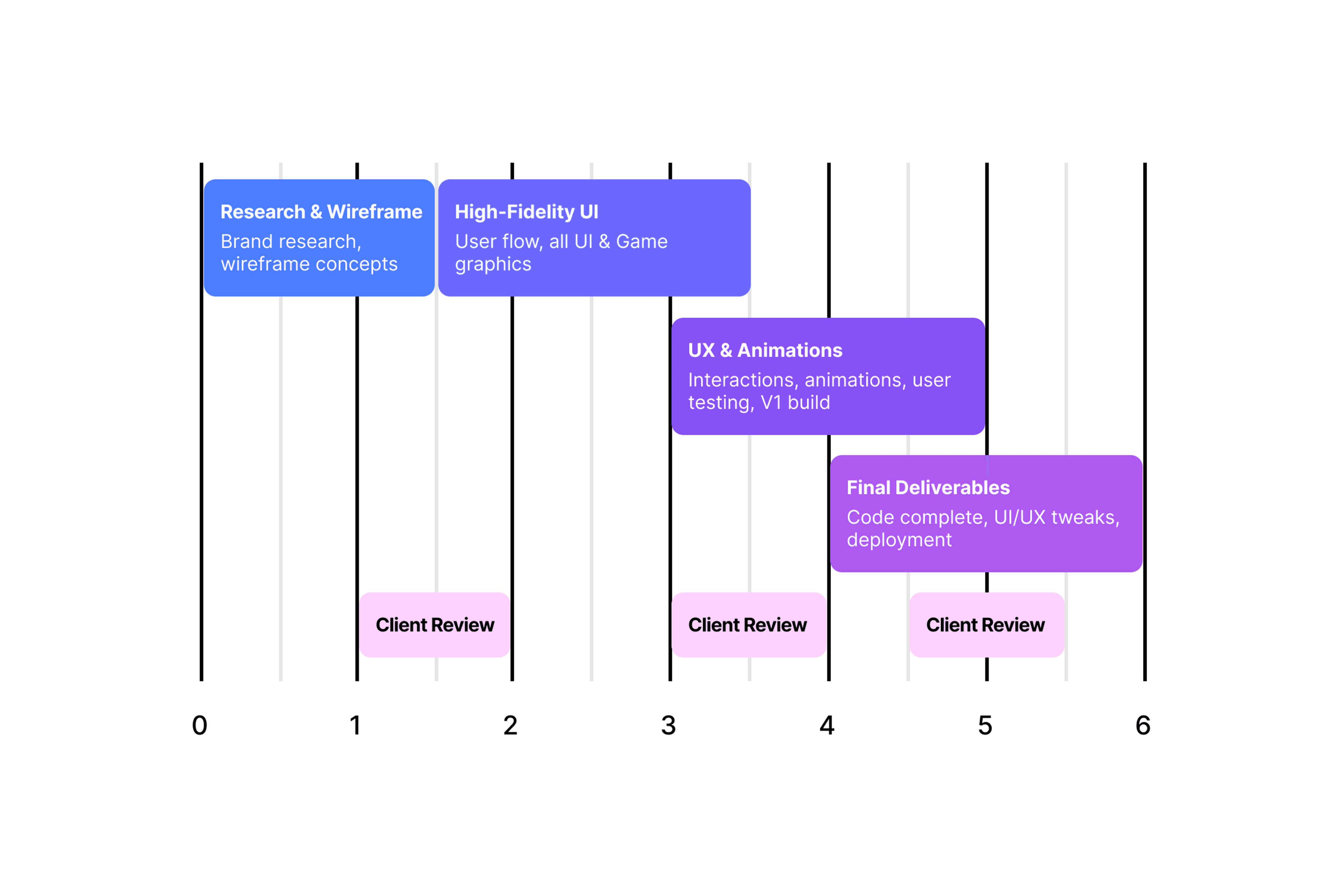
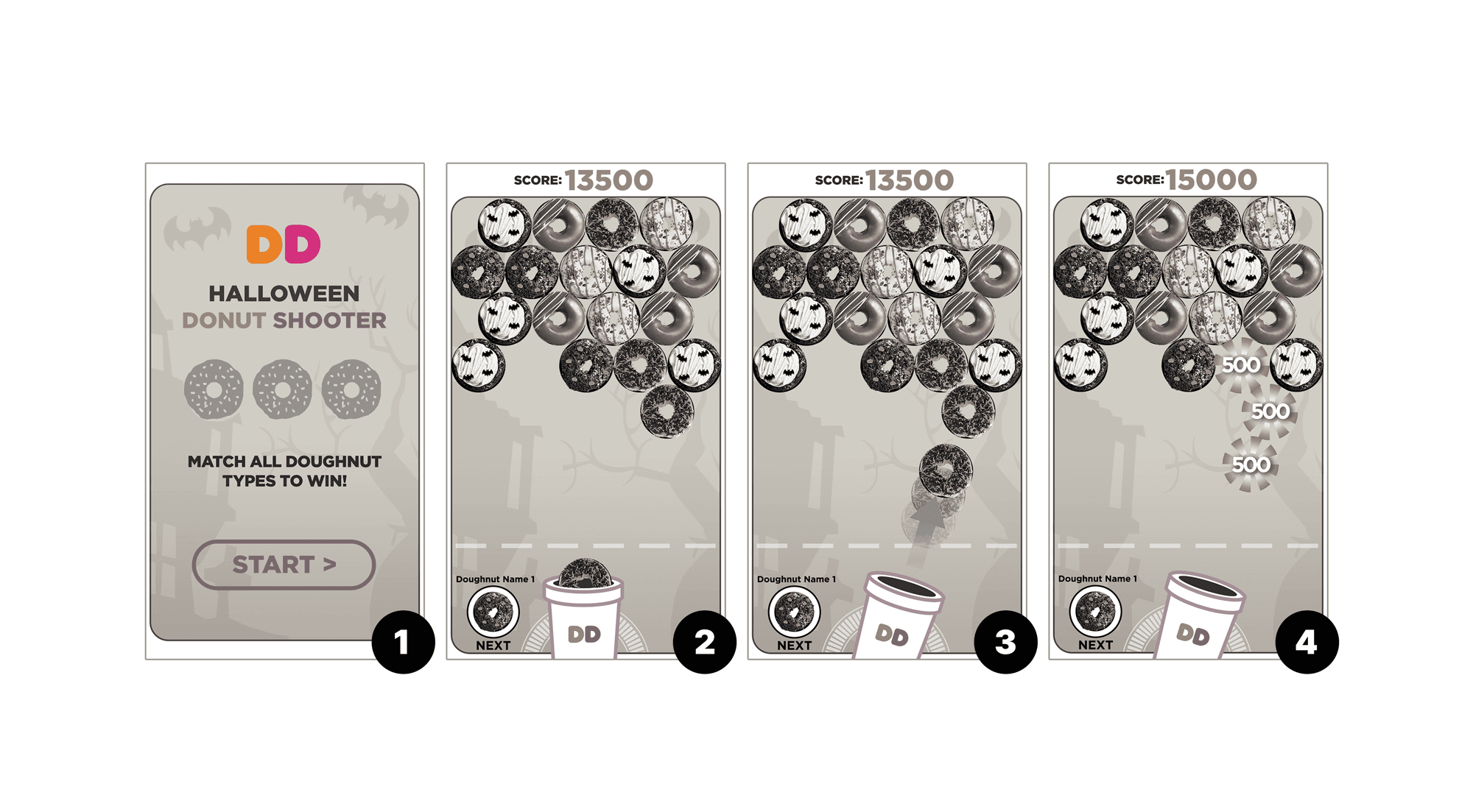
When pitching ideas to the customer, I would usually come up with 2 or 3 experiences that I felt would meet their goals. Below is the first wireframe that demonstrates the branded start and gameplay. I created just enough frames in order to clearly communicate how the game experience would work and have accompanying text to match is numbered example.
When pitching ideas to the customer, I would usually come up with 2 or 3 experiences that I felt would meet their goals. Below is the first wireframe that demonstrates the branded start and gameplay. I created just enough frames in order to clearly communicate how the game experience would work and have accompanying text to match is numbered example.
When pitching ideas to the customer, I would usually come up with 2 or 3 experiences that I felt would meet their goals. Below is the first wireframe that demonstrates the branded start and gameplay. I created just enough frames in order to clearly communicate how the game experience would work and have accompanying text to match is numbered example.

HI-FIDELITY & FLOWS
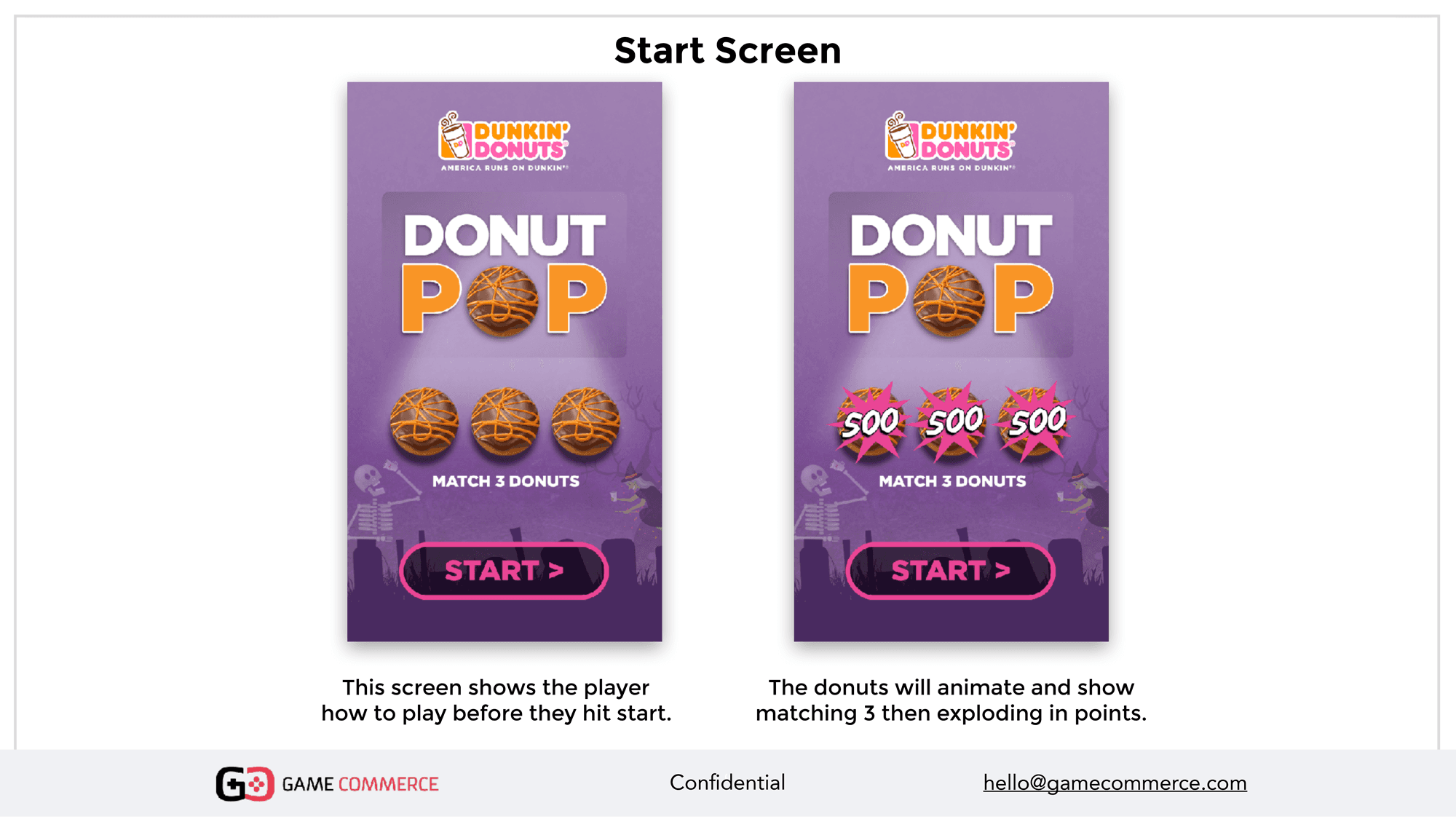
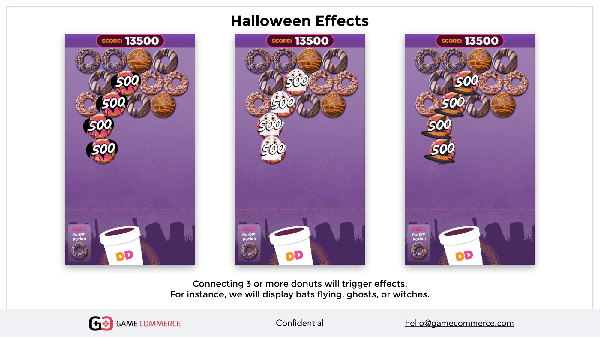
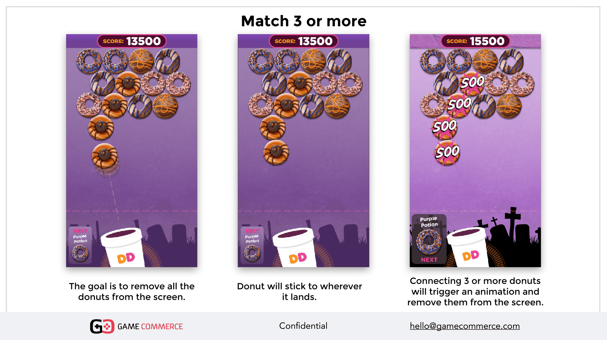
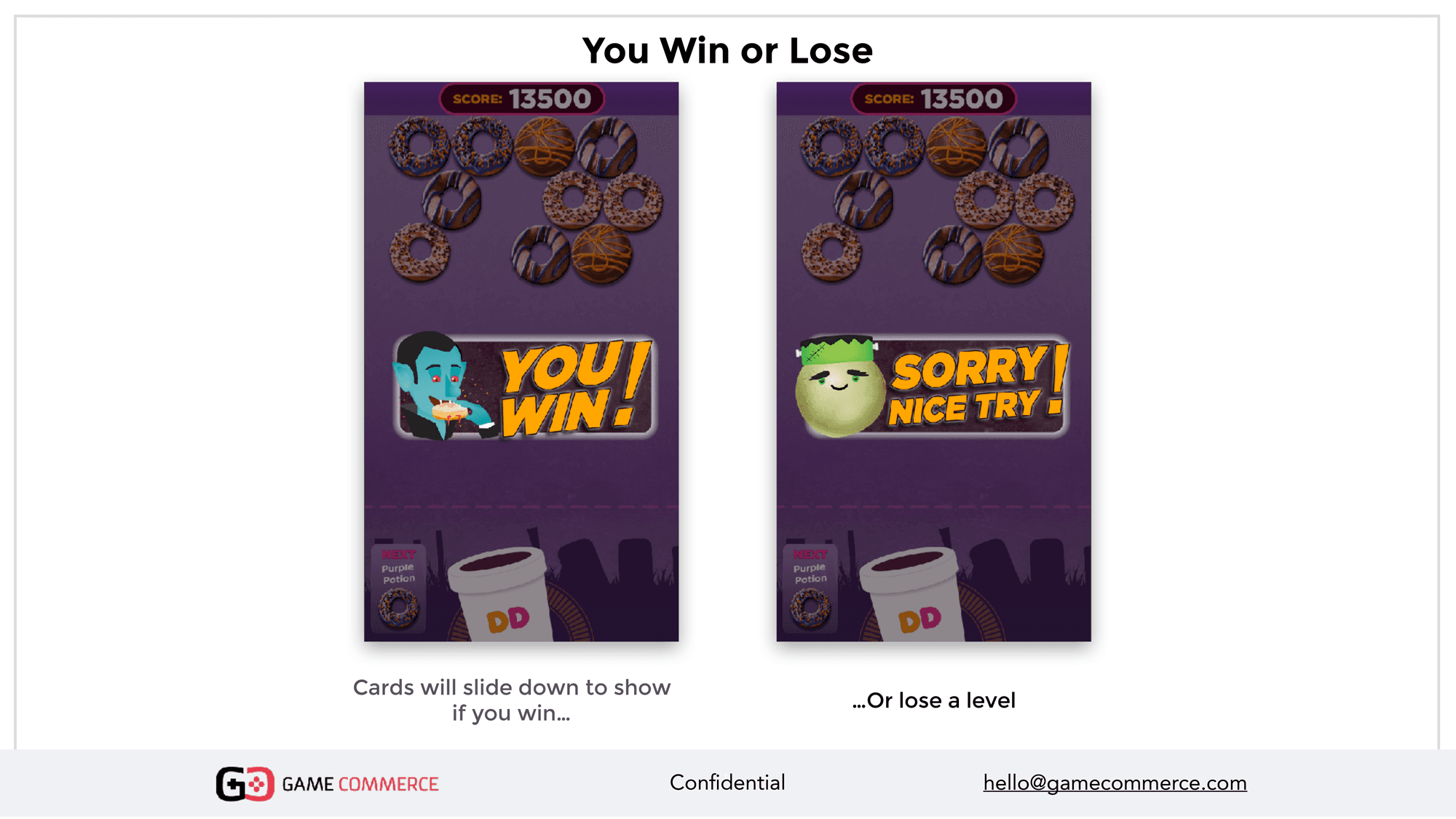
In this part of the process we present a full user flow of the experience to the client. I used hi-fidelity graphics so they can review it and understand the exact feel for the game. Additionally, if there are animations and interactions in the experience, I broke it down into steps so it's easy to follow.
In this part of the process we present a full user flow of the experience to the client. I used hi-fidelity graphics so they can review it and understand the exact feel for the game. Additionally, if there are animations and interactions in the experience, I broke it down into steps so it's easy to follow.
In this part of the process we present a full user flow of the experience to the client. I used hi-fidelity graphics so they can review it and understand the exact feel for the game. Additionally, if there are animations and interactions in the experience, I broke it down into steps so it's easy to follow.





USER TESTING
Before shipping a V1 of the game, we would do extensive user testing, both internally and externally with a select group of opt-in users. During this process I sat in to watch users play, see where they might struggle to understand and gather feedback after the experience was completed. One of the largest goals here was engagement so I wanted to make sure users were having fun playing it. Typically, even with V1 they would often restart the game several times before the session was over unprompted to either try to win a difficult level or beat their high score.
Before shipping a V1 of the game, we would do extensive user testing, both internally and externally with a select group of opt-in users. During this process I sat in to watch users play, see where they might struggle to understand and gather feedback after the experience was completed. One of the largest goals here was engagement so I wanted to make sure users were having fun playing it. Typically, even with V1 they would often restart the game several times before the session was over unprompted to either try to win a difficult level or beat their high score.
Before shipping a V1 of the game, we would do extensive user testing, both internally and externally with a select group of opt-in users. During this process I sat in to watch users play, see where they might struggle to understand and gather feedback after the experience was completed. One of the largest goals here was engagement so I wanted to make sure users were having fun playing it. Typically, even with V1 they would often restart the game several times before the session was over unprompted to either try to win a difficult level or beat their high score.
"Highest engagement for any SnapChat ad ever" - Snap
"Highest engagement for any SnapChat ad ever" - Snap
"Highest engagement for any SnapChat ad ever" - Snap
186 sec
186 sec
playtime
per user
3X replays
3X replays
on average
28%
28%
user
re-engagement
RESULTS
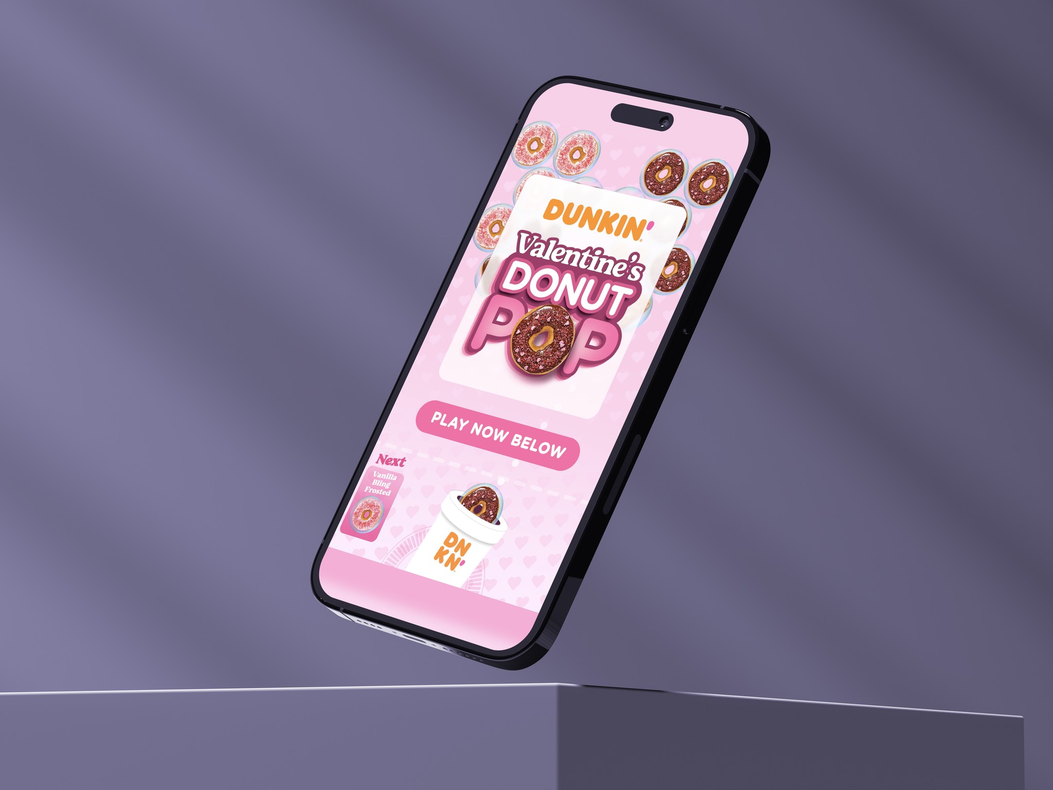
The end result became the highest engagement for any SnapChat ad ever made (told to us by Snap) with an average opt-in playtime of 186s per user, 3X average replays and 28% user re-engagement. After the Halloween experience, we ended up making many different versions of the game for various holidays over the years.
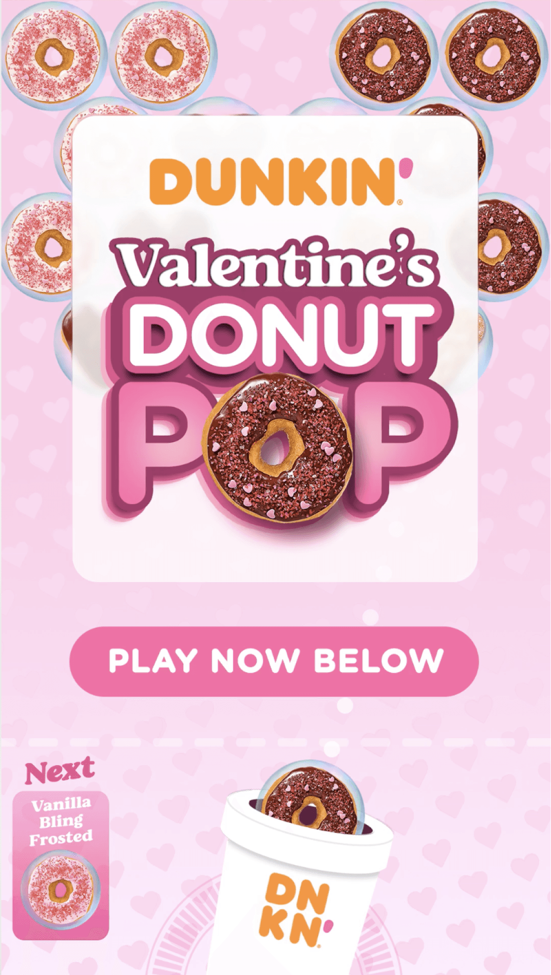
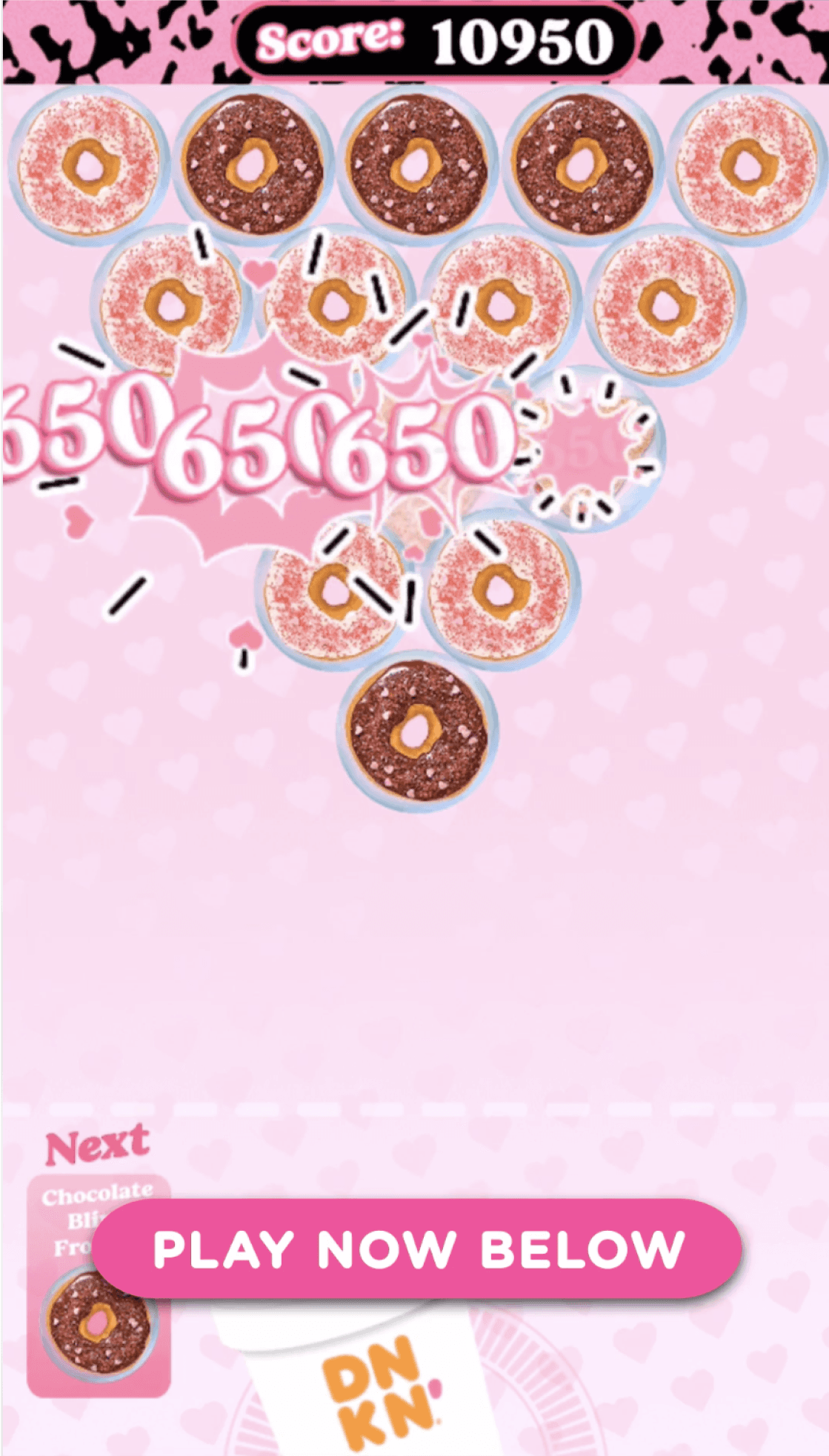
Below are some of the final designs and a video example.


More Case Studies
FIGMA PORTFOLIO
FIGMA PORTFOLIO
To view my work in Figma: https://tinyurl.com/yesjasper
A
A
N
N
D
D
R
R
E
E
W
W
J
J
A
A
S
S
P
P
E
E
R
R
UI/UX PRODUCT DESIGNER
UI/UX PRODUCT
DESIGNER
©2024 Andrew Jasper
Site designed and developed by Jasper. All Rights Reserved.


